AGAINST SATANISM


SIGN UP FOR AGAINST SATANISM

THE ONLY SOLUTION TO SATANISM - THE ENERGY ENHANCEMENT VIDEO MEDITATION COURSE! https://energyenhancement.org/

Energy Enhancement Level 0 - Prana Health Parallel Level for Support of the Four Meditation Levels - Super Chi Prana, Power, Strength, Immortality http://www.energyenhancement.org/LEVEL-Energy-Enhancement-Super-Chi-Immortality-Prana-Meditation-Course.htm EE LEVEL 1 POWER UP!! GROUND NEGATIVE ENERGIES, GAIN INFINITE SPIRITUAL ENERGY! INVINCIBLE SPIRITUAL PROTECTION https://www.energyenhancement.org/Level1.htm EE LEVEL 2 ELIMINATE ENERGY BLOCKAGES https://www.energyenhancement.org/Level2.htm EE LEVEL 3 CLEAN PAST LIFE KARMA BY TRANSMUTATION https://www.energyenhancement.org/Level3.htm EE LEVEL 4 MASTER ENERGY CONNECTIONS AND RELATIONSHIPS https://www.energyenhancement.org/Level4.htm EE LEVEL 5 MASTER ESOTERIC KNOWLEDGE https://www.energyenhancement.org/Level5.htm STUDENT REPORTS https://www.energyenhancement.org/Page17.htm
ENERGY ENHANCEMENT MEDITATION RETREATS AT IGUAZU FALLS
https://eemeditationvideo.org/watch/energy-enhancement-meditation-course-at-brazil-039-s-foz-do-iguacu-falls_FII53z1YVgyszQc.html

53 AGAINST SATANISM EBOOKS

NAME

EMAIL


ARTICLES https://againstsatanism.com/Satchidanand-Substack/satchidanand.substack.com/index.html Against Satanism Home Page Archive 18th March 2024 https://againstsatanism.com/index-18thMarch2024.html Against Satanism Home Page Archive 7th October 2023 https://againstsatanism.com/index-7TH-OCTOBER-2023.html Against Satanism Home Page Archive 29 December 2022 https://againstsatanism.com/index29December2022.html https://againstsatanism.com/Against-Satanism-Articles.htm https://againstsatanism.com/Against-Satanism-Articles-2.htm  https://againstsatanism.com/Against-Satanism-Articles-3.htm FULL LIST https://againstsatanism.com/Against-Satanism-Articles-4.htm

Showing posts sorted by relevance for query redbox. Sort by date Show all posts

Sunday, July 10, 2011

Part 40 - See, it's the "i" of Horus! Red Bull Gives You Wings

One of the most widely promoted phallic Horus Eye brands in the world today has to be Red Bull. Their energy drink seems to be in every retail store that sells drinks. They sponsor a huge variety of sporting events and their participants. Red Bull branding imagery presents a phallic letter combo in the title (db, as introduced here: Part 36 - See, it's the "i" of Horus! Phallic Letter Combos) that matches to female reproductive imagery. In this matter, the Red Bull brand compares to similar RED brands, Redbush and redbox.

Their slogan, "Red Bull gives you wings," when understood in the context of their occult brand imagery attests that this is an ascension scheme! Red Bull is substantially advancing Satan's Eye of Horus and Mark of the Beast agenda beyond even the pharmakeia that may be attributed to the consumption of their product!

A competitor in the energy drink market, NOS was found to have this same pursuit in Part 28 of this series. Why am I continuing to present more examples of how this wicked plot is concealed in brand imagery? Because those who use it to prey on you won't tell you what they're up to. They don't want their cover blown because when you consciously recognize their devices and interpret what they mean, you get what they're up to - and the demonic spell is broken!

so that no advantage would be taken of us by Satan, for we are not ignorant of his schemes.
2 Corinthians 2:11

Confucius observed that, “Signs and symbols rule the world, not words nor laws." There's something to that.

The most obvious symbol in the Red Bull imagery is the big yellow sun, which immediately identifies it as a Horus brand. The solar motif is repeated in their product packaging. Each can of energy drink has a four quadrant color scheme of alternating blue and silver, a solar cross or wheel representation. This closely resembles the signature BMW roundel, a corporate partner in some of their high-visibility activities. (See Part 21 - See, it's the "i" of Horus! More Spirals - BMW's Horus "i" sub brand for more insight into the BMW branding) Red Bull places the yellow sun over the intersection of the cross on the can to bind the two together and multiply the influence of the solar symbols.

The BMW roundel is commonly recognized has having a rotational dynamic because the cross resembles the spinning prop of an airplane. (BMW began as a designer and manufacturer of aircraft engines.) The rotational dynamic is given to the Red Bull product by rotating the vertical with respect to the horizontal.

Update: (11/27/14) The crossed circle of the Red Bull can and BMW's logo is more than just a sun wheel, it's the classic symbol of the mark of the beast. The union of the X and O is believed by initiates into certain Occult mysteries to produce a flash of lightning from the abyss that creates the throne of Isis, the seat of her power. This is the vital energy of the energy drink. You will see shortly how the focus of the cross is on the womb of the goddess. It is claimed that the goddess has the fire of Nodens in her womb.

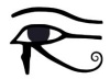
The first collage includes a swirl Eye of Horus variant used to promote a Junior Surf Masters event. 
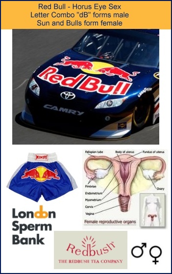
While you might think the yellow sun would be best placed as the pupil of the eye, their placement features sexual union as the key to Horus Eye illumination!

Like the "do" in London Sperm Bank and the "db" in the Redbush Tea Company titles, the "d B" of Red Bull presents a symbol of male genitalia. The use of the upper-case B obfuscates the package slightly, but it also serves to present an instance of Harmerty. The left eye of Horus is darkened as implied by the less perfectly formed testicular "eye ball." The female reproductive system is pictured in the other elements of the brand imagery, the red bulls flanking the yellow sun.

These sexual elements are introduced in this second collage of images captioned "Horus Eye Sex." The car with their sponsor's branding on the hood features the Red Bull imagery in its primary arrangement, with the male and female positioned as engaging in sexual intercourse.

The boxing trunks have only the female elements. Imagine if they had only the title graphic. Yeah. That would be bad. Too obvious.

In the "Bell End" collage I turned the Red Bull and redbox images upside down to better illustrate the glans penis that appears in the orange sun. The bell as a phallic symbol appears in brands like Pennzoil (Pen[is]oil) and Taco Bell (which I'll feature in another post, Lord willing). The names Bel and Baal are associated with Bul and Bull. Notice that the bell end is associated with the sun (Horus) in Red Bull's version, and that Pennzoil has the sun colors and appears inside the eye-shaped ellipse, signaling it as another Eye of Horus. The Pennzoil version features a special bell, the historic "Liberty Bell" in Philadelphia, Pennsylvania. It's associated with Isis, the "liberty" goddess and mother of Horus.

The bell as a musical instrument is a legitimate trans-dimensional portal device that is leveraged for occult purposes, for the casting of spells and cursed enchantments. (See Bells - Supernatural Enchantment and a Biblical Perspective) It's yet one more layer of subliminal and supernatural influence added to the others.

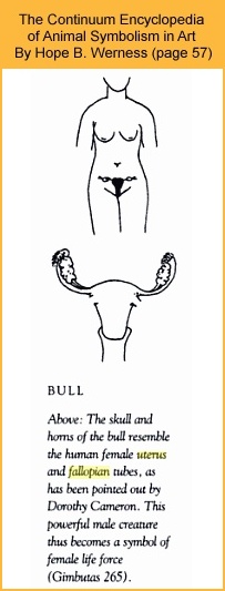
While it's obvious that bulls are virile male animals, Red Bull's use of bull imagery to represent the female reproductive system is quite legitimate. Consider a couple of excerpts from The Continuum Encyclopedia of Animal Symbolism in Art by Hope B. Werness. The illustration at left appears in the book on the same page.

"If Leroi-Gourhan is correct, despite its powerful masculinity, the bull symbolized the female principle in nature, forming a COMPLEMENTARY DUALITY with the horse."

"Gimbutas also associates the bull with the female principle, arguing that the bull is one of many symbols of the GREAT GODDESS, herself the all-embracing symbol of human, animal and plant fertility, of life force, and the cycles of life and death."

A related example appears in the Dodge Ram brand where the stylized head of a ram (male goat) presents the female reproductive system. ("Daughters of men" red (Adam) color, "daughters of men" shield as downward pointing delta.)

The following excerpt is from The Archetype of the Womb - Part II by Theresa C. Dintino

"When people speak of “fertility Goddesses” many go directly to the process of birth and reproduction, to insemination. Honoring of ‘fertility’ is so much more. It is a complex honoring of the life process of generation, death, regeneration, becoming, dissolving, becoming again. This includes honoring ovulation, and the absolute magic of the process carried out by the human female ovaries every moon, itself a cyclical process of generation, death and rebirth. Honoring fertility includes an honoring of the Archetype of the Womb which includes the uterus, fallopian tubes and ovaries. The ‘horns’ are the fallopian tubes and ovaries. The Archetype of the Womb includes all of these components of woman’s womb center. The Archetype of the Womb is horned or, as I like to refer to it, ‘winged’, the fallopian tubes and ovaries that which allow it to ‘take flight’."

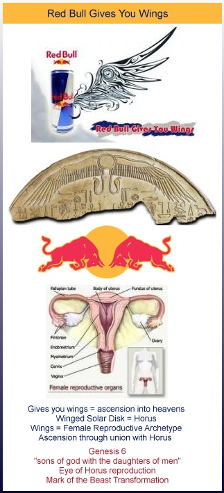
Those responsible for branding Red Bull understand the wings and flight to which Ms. Dintino refers. Their slogan is, "Red Bull gives you wings." This is intended, most superficially, of course, to suggest the influence of the energy drink when consumed. On another physical level, through the subliminal referencing of the "Archetype of the Womb," the brand promises wings to the young men who are the targeted consumers, wings meaning females, fertile females with whom to mate. On the deepest level, this promise of wings must be seen as the familiar "ascension through sexual union with the gods" scheme implicit in every other Horus Eye branding!

At the top of this collage captioned with their slogan appears one of their marketing images. Underneath it appears an earlier promotion, much earlier. The winged solar disk is associated with the Sun god Horus. In other cultures the winged disk symbol refers to the same entity under a variety of names. This is the "winged" Red Bull fertility goddess Isis and the sun god Horus's bell end phallus. This is yet one more Mark of the Beast promotion!

Here's some interesting links about the winged sun disk.

The winged sun disc "By this time Behdety had become identified with Horus..."

Relief Depicting Gilgamesh Between Two Bull-Men Supporting a Winged Sun Disk, Fr.Tell-Halaf, Syria (Gilgamesh aka Nimrod aka Horus ... Antichrist Beast)

Winged Sun Discs or Advanced Personal Transport Devices

Osiris, The Oscars and The Babylon Gate

Horus - Ancient Egypt: The Mythology

This image with the winged disk is on what's called the Ben Ben Stone.

There is a genuine winged sun and a counterfeit.

1) “For behold, the day is coming, burning like a furnace; and all the arrogant and every evildoer will be chaff; and the day that is coming will set them ablaze,” says the LORD of hosts, “so that it will leave them neither root nor branch.”
2) “But for you who fear My name, the sun of righteousness will rise with healing in its wings; and you will go forth and skip about like calves from the stall.
3) You will tread down the wicked, for they will be ashes under the soles of your feet on the day which I am preparing,” says the LORD of hosts.
Malachi 4:2

The counterfeit sees the demise of his family plan in that passage of scripture. That's not going to be a pleasant season for the arrogant and evildoer. The Red Bull plan looks like a crash and burn to me. Their champion will fall like Goliath.

Can you read "reproductive energy" in the Red Bull energy drink imagery? Praise the Lord!

11) Put on the whole armour of God, that ye may be able to stand against the wiles of the devil.
12) For we wrestle not against flesh and blood, but against principalities, against powers, against the rulers of the darkness of this world, against spiritual wickedness in high places.
13) Wherefore take unto you the whole armour of God, that ye may be able to withstand in the evil day, and having done all, to stand.
Ephesians 6:11-13

Saturday, February 06, 2016

Trending: Hidden Evidence of Nazi Influence

You may have noticed the trending theme of imagery being uncovered that indicates support for Nazi ideology. The Lord continues to bring this to our attention. With our primary focus of our attention still on the big picture, the pending reset of time, we have been considering the significance of this insight into the role of the Nazis. It was back in 2012 during the season of blogging about the London Olympics that the Lord highlighted to us how important the Nazi connection was in what we were seeing. Search the blog for those observations made at that time. We knew the mega rituals we we were seeing at that time were a really big deal but we didn't know what what going to be accomplished by it. More insight has come, and we feel there is still more to be brought forth.

Here's a survey of some of what has come to our attention in the media lately.

The night after posting the notice that the 7th installment in the video series decoding Back to the Future I was watching DC's Legends of Tomorrow, on The CW. I saw this image for a German bank in one of the scenes. The team of time travellers went there on a mission.


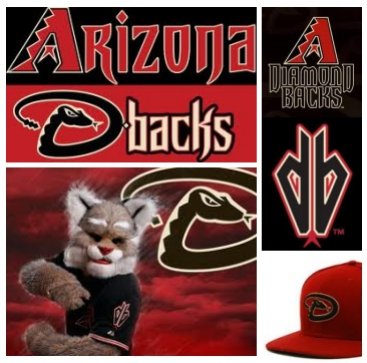
The graphic of the back-to-back Bs at the Brümberg Bank is a near match to the back-to-back Bs of the Buckaroo Bansai roundel design. If you watch the video that I had posted online only a few hours earlier you'll see why that's so notable, with a 14-88 Neo-Nazi code embedded in the title as noted in the graphic you see here. The double B suggests the phallic package for some symbol sex magick (not unlike the Arizona Diamondbacks (reverses to the snake head), Redbush, RedBox or Red Bull branding), but beyond that, see the double B as an 88, and note that the bank is German and the design of the logo and bird suggests the Nazi era. The number 88 is neo-Nazi code for, HH - for Heil Hitler. One of the officials at the bank looked like a poster boy for Aryian race propaganda. The enemy of the Legends of Tomorrow team is an immortal, and since they can't kill an immortal they thought their best plan would be to limit his ability to do harm by cutting off his funds. Now, as it is said that time is money, there is definitely an esoteric layering in the metaphor. The LoT time travelers have a violent fight scene in the BB-88 bank. Buckaroo Bansai traveled to the 8th dimension and back in a car stamped with the 88 and he battled with those from the other dimension. 88 - Heil Hitler - Nazi technology and ideology, time and dimension traveling, and battles waging over the fate of humanity. Trending!

This is all witnessed in the context of a prolonged focus on, Back to the Future, where the Nazi science of time travel is cryptically featured and high ranking SS officers are secretly characterized. In that series, underscoring the pro-Nazi sentiment is the 14-88 code associated with David Lane of, The Order, and with roots in Adolph Hitler's, Mein Kampf. Some of the instances I found appear in the following screenshots, with more in part 6 of the video series.


In a recent post I pointed out how that same Neo-Nazi code appears in the title of the History Channel's documentary called, Hunting Hitler. Hunting Hitler - HH - Heil Hitler - H, is 8th letter, so HH is also 88. The title, Hunting Hitler, has 13 letters plus one space, so in total there are 14 character positions in the string. This observation suggests why so much money and effort went into exposing the evidence that we were officially lied to about Hitler's demise in a bunker in Berlin.

While we have been led to completely ignore the activity of Steve Quayle and his associates for most of the past year, the Lord did direct our attention to his latest release, a book titled, Empire Beneath the Ice. It's very pertinent to what's trending, how Hitler and the Nazi's don't seem to have lost the war, in the big picture. To me, they seem only to have lost in the same way the Jesuits and Freemasons have seemed to lose in times past. They go dark, and underground, where their influential work flourishes. While Steve's researchers have done an impressive job, we find Steve's conclusions generally falling far short.

So many of these Nazi themed elements have rather obvious roots in ancient and ongoing fallen angel activity. Much of this has to do with sorcery and sacrificial ritual, and mind-control programming.

“"Svali" is the pseudonym of the woman, age 45, who was a mind "programmer" for the cult until 1996. She was the sixth head trainer in the San Diego branch and had 30 trainers reporting to her. She has risked her life to warn humanity of the Illuminati's covert power and agenda. She describes a sadistic Satanic cult led by the richest and most powerful people in the world. It is largely homosexual and pedophile, practises animal sacrifice and ritual murder. It works "hand in glove" with the CIA and Freemasonry. It is Aryan supremacist (German is spoken at the top) but welcomes Jewish apostates. ”
(Henry Makow's website)

I made a relevant observation in this post, Our Reality as Trance State, CERN, The Man in the High Castle, SHIELD-HYDRA Code 88. The Amazon series was based on a story by Phillip K. Dick. What was so powerfully pictured was a world in which the Axis powers won WWII. You have to ask yourself if, on a fundamental level, it's very different from our own present reality? Here's how the pro-Nazi sentiment expressed in the secretive embedding of 88 appears in some screenshots.


A couple weeks ago, Aaron and I watched Marvel's Ant-Man. Aaron noticed how the SS letters were repeatedly shown while the other wording was occulted in the company name, Cross Technologies. These were more than fleeting moments so it was evident that the signaling of SS was intended.


SS. When Z is 1, S is the 8th letter, so SS = 88. It's equivalent to the HH, signaling Heil Hitler. The SS is easily identified with the Nazi organization, Schutzstauffel. The SS was responsible for the special “extra-dimensional” and super-normal projects that really mattered.

In Ant-Man, the Cross Technologies company had dangerous technology altering the physics of biology that they intended to sell to HYDRA, the evil organization that is so central in the Marvel universe. Marvel, now owned by Disney, has always been very overt with their identification of HYDRA with the WWII era Nazi party and the SS. Moster interesting is how it's also done covertly in the subtle esoteric way of the Occult to signal that this is where their loyalties actually lie. 
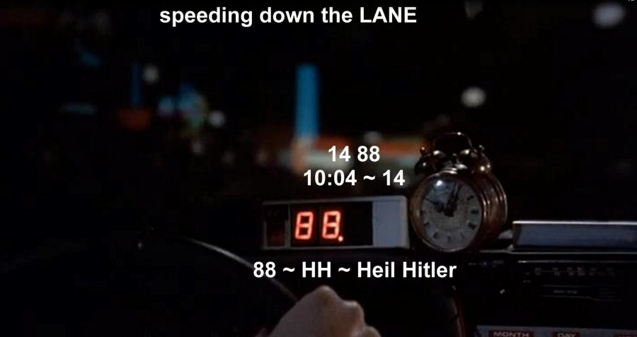
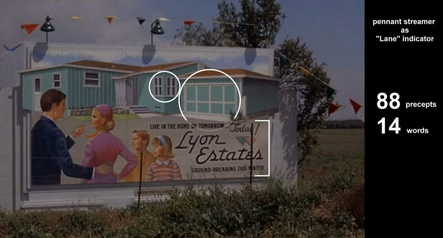
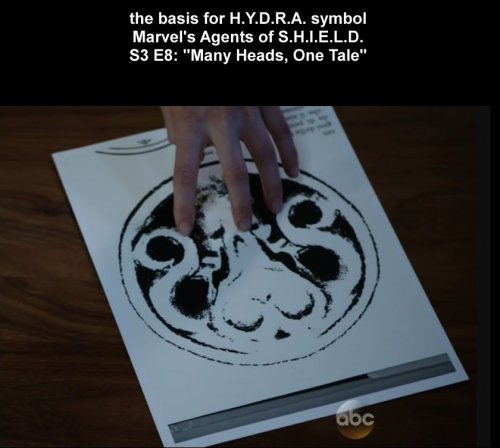
One example I've pointed out on the blog already is in the history of the HYDRA logo. In an episode of The Agents of SHIELD, in connection with research done about what we learned was a long time effort to bring back an ancient entity through a space-time portal to rule the earth (seem familiar, somehow?), several iterations of the imagery were displayed. These were recognized as precursors to the HYDRA logo. The one you see here convinced them of the connection. Again, the connection between HYDRA and the Nazi party is unquestionable, and you can discern an 88 hidden in the esoteric design. HH - Heil Hitler. SS.

Aaron and I found the logo of Cross Technologies worthy of note. First, Cross - crucifixion - messianic - Antichrist.

There's 12 ring sections + 1 of a different sort, a complete circle. This produces the time numbers 12 and and the one for the mastery of time and space-time - 13. It's a big time XO graphic as the basic design is a circle with a couple of X shapes intersecting in the middle. The word, Cross, is a cross, of course, which is seen with the circular graphic. CROSS circle. Three circles signals. 666 (dot plus 2 that are implied by larger C ring segments) The XO is claimed to be a symbol of the mark of the beast, and the 666 is famously identified with the beast and his mark in Revelation 13:18. There's 666 triple O (as O is 1+5=6) produced in the vertical lining up of the O in TechnOlogies with the O in CrOss and the round O graphic. The 2 C shapes (rotated and concentric) - Code 33. The 8 spoked wheel design presents the 8 point star of Inanna, the goddess. Her celestial throne is established in the union of the X and O, supernaturally, according to the influential OTO.

Yesterday I saw an ad for Drake's latest. Here's the cover art. Summer Sixteen ~ SS ~ Heil Hitler! What's up with the eye in the 6?

Like the T-Mobile commercials tell us in their Rosetta Stone-like marketing imagery, the okay sign over the eye is a 666 eye, hidden eye, third eye, anal eye of Horus sign.


It signals the illumination wrought through ritual sodomy as practiced in trauma-based mind control programming. In military and law enforcement, we often hear the expression, “I've got your six.” It's a reference to your backside and protecting it. The eye in a 6 is a backside eye, the terminus of the GI tract they refer to as the all-seeing eye of Horus. The 6 also resembles the letter G, which is seen in connection with Freemasonry with an eye inside it and in association with the square and compass. The G-EYE - the GI tract. The Pink Swastika documented the violent homosexual bent of the Nazi party. Their involvement in advancing the ancient way of illumination is legendary. Summer Sixteen. SS.

This post is pretty big and you might think that's all of it, but no.

Friday, February 12, 2016

In the Spirit of Valentine's Day... Walgreens. W is for Witch, Whore, some ideograms and Wedjat!

16 “Now no one after lighting a lamp covers it over with a container, or puts it under a bed; but he puts it on a lampstand, so that those who come in may see the light. 17 For nothing is hidden that will not become evident, nor anything secret that will not be known and come to light. 18 So take care how you listen; for whoever has, to him more shall be given; and whoever does not have, even what he thinks he has shall be taken away from him.” ~ Luke 8:16-18

You'll see in this post how the Walgreens Pharmacy brand is actively spreading pharmakeia - even aside from their being in the pharmaceutical and cosmetic industry. It's another brand that, like redbox, leverages the color red in the Valentine's Day season to enhance its own brand identity. With this color and some distinctly related symbolism they celebrate the goddess of love, of magic, the bee goddess as queen of heaven, and the scarlet woman, the great harlot, Mystery Babylon the Great. This brand's imagery is very ancient and powerful, signaling even the Eye of Horus that is at the very root of their industry.

This ad that I found on their Facebook page establishes their intent, to those of us who can decode it, and the subtlety of the layering enhances the mind-control factor and raises the harvest of ritual (demonic spirit) energy gained from their magickal practice of theurgy. We'll decode that shortly.

The branding of Walgreens always includes their stylized W. They brought a lawsuit against the Wegmans supermarket chain in 2010 with an assertion that the stylized W they were using was too similar. Wegmans yielded to their demands.

On a very fundamental level, the stylized W they are so protective of features the ancient symbol of the mark of the beast, the heart of the sigil of Nodens, god of the abyss, which is the crossing of circles. The form is evident in the looping vesica piscis-like center of the W. It's the union of the “double U,” as we say the letter. As signaling the union of the X and O, this is claimed by those who should know to represent a divine sexual union and to establish the celestial throne of the goddess. Additional to the loop's crossing circles, the mark hanging off the left side creates another instance for redundancy, effectively crossing the arc of a circle with a potent half Tau on the circumference.

The Walgreens brand has been identified with the color red and the image of a blue mortar and pestle with white stars (replaced with an update in 2006). That version has a subtle patriotic look, with white stars on a blue field, and with the color red it's a theme that resonated with the slogan of their branding: The Pharmacy America Trusts. Given that Walgreens is today the largest drug retailing chain in the United States their slogan made a legitimate claim.

Walgreens logo until 2006
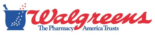
It makes good marketing sense to signal the waving of the national flag to attract the patriotic. At the root of that attraction, if you have eyes to see it, is how America's loves Columbia, Liberty and Freedom, all being national goddess identities. The District of Columbia is on a parcel of land that is part of a grant from Virgina and Maryland. VIRGIN MARY LAND. This patriotic theme is very much one of the goddess. The essence of Walgreens' branding goes beyond the patriotic sense - reaching right on through to the goddess.

Here's what FamousLogos.net (DESIGN ELEMENTS, HISTORY AND EVOLUTION OF WALGREENS LOGO ) has to say about it. “The Walgreens logo is one of the most popular logos in the pharmaceutical industry. It has served as a critical aspect in the company’s success and continuous growth. The current version of the Walgreens logotype was introduced in 2006 when the company decided to simplify it and remove the cup symbol featuring fifteen stars, which was a prominent feature of the old corporate logo which typified “magical healing”.”

Note the observation that it typified “magical healing.”

In updating their brand imagery Walgreens dropped the blue color and the star motif but retained their essential stylized W, the dominant red color with the white, and the imagery of the mortar and pestle. Not that many folks these days can identify the mortar and pestle beyond linking it with the Rx, like you see in this screenshot of an old fashioned drugstore from a scene in the animated feature from 1999, The Iron Giant. See it on the window glass?


The mortar and pestle have been used for thousands of years to grind roots and herbs into powder and to mix ingredients together. These may be used in the visual arts for making pigments, or by chemists, cooks - or witches. As FamousLogos.net observed about the Walgreens brand, they may be used for “magical healing.” They are also used for other magical preparations like charms and potions. 
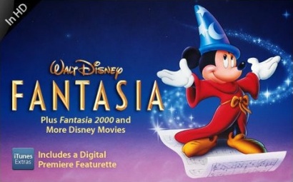
In our culture, Disney has famously used the flowing stars motif to represent magic in such popular films as the classic, Fantasia. Micky Mouse, the Sorcerer's Apprentice, wasn't doing any magical healing but he was certainly casting a magic spell.

What does the Walgreens W signify? One one level, W is for Witch, or Warlock or Witchcraft. Here's a collection of images found when I searched for witch mortar pestle.


Witches still use the mortar and pestle in their homes for the same reasons they always have. These tools of the craft are often inscribed with magickal symbols. And, so is the one Walgreens has presently branded themselves with. W is for Witch.

Walgreens is a pharmacy. The word comes from the Greek, pharmakeia. The word is used in the Bible and is usually translated as sorcery or drug spells, depending on what version you're looking at. (See Pharmaceuticals -The Sorceries of Babylon for more insight.)

19 Now the deeds of the flesh are evident, which are: immorality, impurity, sensuality, 20 idolatry, sorcery (pharmakeia), enmities, strife, jealousy, outbursts of anger, disputes, dissensions, factions, 21 envying, drunkenness, carousing, and things like these, of which I forewarn you, just as I have forewarned you, that those who practice such things will not inherit the kingdom of God. ~ Galatians 5:19-21

21 Then a strong angel took up a stone like a great millstone and threw it into the sea, saying, “So will Babylon, the great city, be thrown down with violence, and will not be found any longer. 22 And the sound of harpists and musicians and flute-players and trumpeters will not be heard in you any longer; and no craftsman of any craft will be found in you any longer; and the sound of a mill will not be heard in you any longer; 23 and the light of a lamp will not shine in you any longer; and the voice of the bridegroom and bride will not be heard in you any longer; for your merchants were the great men of the earth, because all the nations were deceived by your sorcery (pharmakeia). 24 And in her was found the blood of prophets and of saints and of all who have been slain on the earth.” ~ Revelation 18:21-24

I note that a millstone is for grinding, like a mortar and pestle. So, the pharmakeia deceived all the nations, which is to say, cast magical spells that deceived. Deceiving spirits are being deployed and employed. The agency responsible is named as the great city Babylon, in verse 23 above. Verse 24, again, declares: “And in her was found the blood of prophets and of saints and of all who have been slain on the earth.” Blood. Lots of blood. Blood is red. Walgreens Pharmakeia red.

1 Then one of the seven angels who had the seven bowls came and spoke with me, saying, “Come here, I will show you the judgment of the great harlot who sits on many waters, 2 with whom the kings of the earth committed acts of immorality, and those who dwell on the earth were made drunk with the wine of her immorality.” 3 And he carried me away in the Spirit into a wilderness; and I saw a woman sitting on a scarlet beast, full of blasphemous names, having seven heads and ten horns. 4 The woman was clothed in purple and scarlet, and adorned with gold and precious stones and pearls, having in her hand a gold cup full of abominations and of the unclean things of her immorality, 5 and on her forehead a name was written, a mystery, “BABYLON THE GREAT, THE MOTHER OF HARLOTS AND OF THE ABOMINATIONS OF THE EARTH.” 6 And I saw the woman drunk with the blood of the saints, and with the blood of the witnesses of Jesus. When I saw her, I wondered greatly. ~ Revelation 17:1-6

This woman sits on a scarlet beast, clothed in purple and scarlet. The color, scarlet, is a bright red. Those who dwell on the earth are made drunk with the wine of her immorality, and wine is typically red. Verse 6, again, declares: “And I saw the woman drunk with the blood of the saints, and with the blood of the witnesses of Jesus. ” Again, blood is red. Walgreens Pharmakeia red. The branding of Walgreens is identified with the sponsor of pharmakeia. On one level, W is for Whore, the harlot with the golden cup who is drunk on the blood, Babylon the Great.

Cosmetics that are used for beautification represent a very significant part of the Walgreens business, and the mortar and pestle have long been used for those preparations. Where did these ideas and practices come from, and where does this all lead? Have you read Genesis 6? The book of Enoch has more to say on the subject.

1) And they took wives for themselves and everyone chose for himself one each. And they began to go into them and were promiscuous with them. And they taught them charms and spells, and they showed them the cutting of roots and trees. 2) And they became pregnant and bore large giants. And their height was three thousand cubits. 3) These devoured all the toil of men; until men were unable to sustain them. 4) And the giants turned against them in order to devour men. 5) And they began to sin against birds, and against animals, and against reptiles, and against fish, and they devoured one another's flesh, and drank the blood from it. 6) Then the Earth complained about the lawless ones. ~ Enoch 7

1) And Azazel taught men to make swords, and daggers, and shields, and breastplates. And he showed them the things after these, and the art of making them; bracelets, and ornaments, and the art of making up the eyes, and of beautifying the eyelids, and the most precious stones, and all kinds of coloured dyes. And the world was changed. 2) And there was great impiety, and much fornication, and they went astray, and all their ways became corrupt. 3) Amezarak taught all those who cast spells and cut roots, Armaros the release of spells, and Baraqiel astrologers, and Kokabiel portents, and Tamiel taught astrology, and Asradel taught the path of the Moon. 4) And at the destruction of men they cried out; and their voices reached Heaven. ~ Enoch 8

They, the sons of god together with the daughters of men, bore offspring, because they had a reproductive agenda. They would have used tools like the mortar and pestle to do the spells, cosmetics and colored dyes, according to the ways of Azazel, Amezarak and Armaros and their fallen companions.

Because of the nature of this material I'll offer a caveat. If you're easily offended by descriptions of imagery that is fundamentally graphic, you're probably not going to want to see what's on exhibit here.

Here's what the W of Walgreens red and white branding represents, alongside Witch and Whore. With features of what's known as the divine feminine and the goddess, the W is an idogram. The stylized W pictures the female with her rounded hips, the yonic loop as the vagina and the bottom as her bottom. (As sexual imagery, the mortar is symbolic of the womb while the pestle represents the phallus.) As another ideogram, it's a classic! The W pictures the bent elbow pose that has been identified with the goddess Inanna from ancient times. This is very, a very common symbol in media.


The queen of heaven has a beehive hairdo/hat/crown, bee wings, and the bent elbow pose suggestive of the dancing bee that is easily recognized as the basis for the goddess modeling W. For other examples, remember this post from 2014, with the hard-to-forget and imaginative Virgin America safety video? Part 5 - Hidden Signs of the Goddess - Awareness Ribbons and Dancing Bees. In 2015's Jupiter Ascending, Mila Kunis played a character who was recognized by the bees as her queen. That was given plenty of attention because it was an important part of the plot development.


What was given no overt attention at all was that her bent elbow gesturing during the scene where she kind of conducts and dances with the bees is itself a symbol used to identify the ancient goddess. They were carefully NOT TELLING US about that, covertly, because it's an Occult magickal element of their theurgical symbol work.

That the W is leveraged by Walgreens as the goddess symbol is supported by their Valentine's Day Facebook promotion, so let's decode it.

Their iconic W appears on their “corner” graphic. The W is the bent elbow dancing bee pose. Why do you suppose the boy wears a sweater like a striped bee? Why do you suppose he's gesturing with a bent elbow? It naturally supports the goddess theme! Like the red, on red. To most folks, the stylized heart means love. We see a sign that looks like, “I heart NY” but we interpret it to say, “I love NY.” The little boy is kind of like Cupid. He's a little older than the customary cherub figure - and clothed - but he's blowing hearts like kisses to disperse them which is akin to shooting arrows. Cupid, Eros - some consider him to be the son of the goddess of love. Like the stream of stars in the Walgreens former mortar graphic, the stream of hearts suggests the magickal spell casting of love potion pharmakeia, akin to Cupid's arrows.

The designers set the W ideogram upon the stylized heart ideogram, both being yonic or symbolic of the female genitalia - but it's not all about the divine feminine!

They opted for the updated branding of their corner graphic. This one resembles two adjacent faces of a cube, probably to represent a corner, because their current slogan is: “at the corner of Happy and Healthy.” (And, I can't help but see in this the emphasized double H signaling of “Heil Hitler,” betraying an undercurrent of Neo-Nazi support for Hitler and his ideals. Still trending, BTW!) 
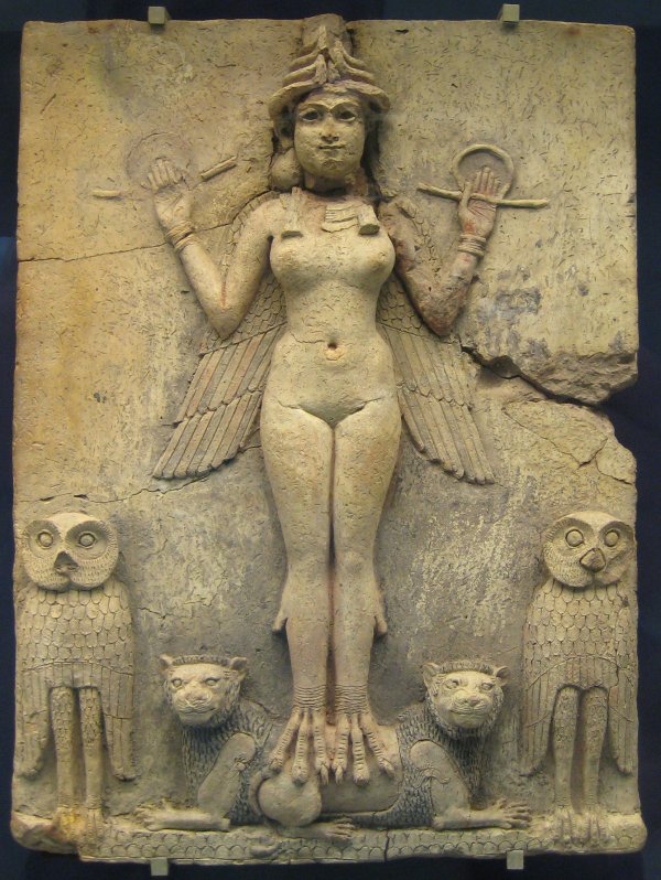
With a few more observations it becomes rather obvious why they chose this corner version of the logo and why it was placed where we see it on the promotion's stylized heart, and this exposes a key essential layer of symbolism at the heart of their precious stylized W!

So far in this post, no mention has been made of one of the fundamentals of the Adversary's mechanisms of influence and control, ritual sodomy and the illumination it brings - but here it is! In two dimensions, their corner graphic is composed of a square and a triangle. With an understanding of the stylized heart shape as picturing the butt, the positioning of their corner graphic places the triangle element where we might expect the anus. The triangle signifies the anal triangle. Get it? The ideogram of the stylized W as hips and a bottom supports that of the heart as butt. The straight sides of the square square the circles of the halves of the heart. The square itself, as seen in its larger and independent versions, has a pair of rounded corners, and a rounded square is the squared circle, signaling ritual sodomy. Consider the view of the cube's corner. It's seen from below, so we're seeing the triangle from a perspective as through the bottom. Think, bottom, anatomically. Through the bottom. SEEING through the bottom. With the eye, seeing.

To make this more plain, that it's anatomical in nature. They add the Registered Trademark to their brand's corner graphic. The Registered Trademark symbol, as I have documented several times over the years, is the darkened moon eye of Harmerty. It's not mandated, legally, but is added to enhance the Occult power of the design. Where's the seeing sun eye of Horus that matches to the little darkened eye? The stylized W actually resembles an eye, with the loop as a reptilian or feline pupil or iris. The serif-like flourish embellishes it to suggest the typically stylized eye of Horus. The anus is known to those on the left-hand path as the Eye of Horus.

The Walgreens Valentine's Day Facebook imagery features a little boy because the innocent young boys are the primary targets of the pedophile sodomites who exploit every opportunity to elevate themselves in the company of their gods by targeting the innocent to acquire their qualities, supernaturally. The ad copy reads, “Make hearts burst with this adorable DIY Valentine's Day card idea!” The idea is about ritual sodomy programming, which is trauma-based. To make hearts burst is, in their coded language, to make butts burst, which is the horrifying reality of what the handlers do to their adored young victims, who are typically 3 or 4 years of age, or even younger.

So, what is the meaning of the iconic Walgreens W? W is for Wadjet and Wedjat! As Wikipedia indicates, the eye is personified in the goddess, Wadjet. The eye is the Eye of Horus!


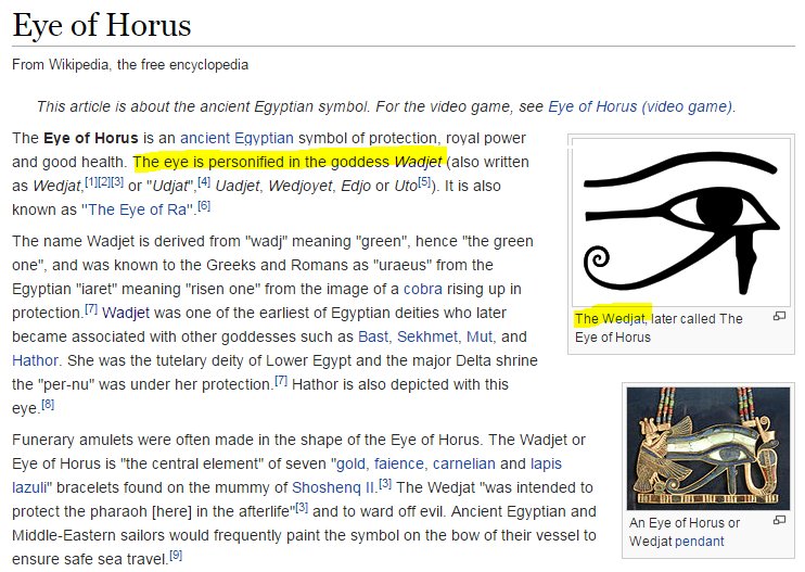
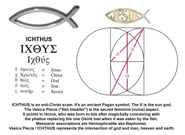
The form of the stylized W conceals what you may now recognize as the fish symbol, the ICHTHUS. This fish represents the fish that ate the phallus of Osiris, and implies that very phallus of Osiris. In the butts, of the W ideogram's hips and the heart ideogram's butt. Sodomite ritual. The Illumination produced through that foul practice is signified by the color white. It had formerly been my custom to document this regularly, and lately, not so much, yet the combination of the white and red does signify the red-daughters of men made white-divine.

We've already considered the evidence for the Walgreen's brand's exaltation of the goddess under many guises and with many symbols.The iconic Walgreens W is for Witch, and Whore, and the stylized form pictures the divine feminine and the bent arm pose of the bee goddess queen of heaven, and the magickal phallus of Osiris. The Eye of Horus has also been documented as present in the branding. The W is for Wedjat, to be sure! How familiar are you with Walgreens, or with any other pharmacy, for that matter? If you haven't seen the sign of the Rx as you approached the store or strolled through the aisles you have been living as one who walks in their sleep, deep in slumber. Rx is the ideogram for the eye of Horus, as modeled on the Peregrine falcon form he takes. You see it on the labels of prescription drugs and on over-the-counter meds as well. The sign of Rx is the eye of Horus. Rx = Wedjat. The W is for Wedjat.

In this peculiar and very special season, recognizing and acknowledging these things in our familiar world still does matter, as does our character development. May the Lord Y'shua's favor be upon you. I pray that you will truly seek Him and His good pleasure above all else in this world. He is worthy!

Monday, July 04, 2011

Part 39 - See, it's the "i" of Horus! Doubled Letter Genitalia

We continue the Horus Eye themed presentation of phallic letter combos found in brand imagery with a focus on variants where the same letter is used two times, repeating in some form to picture the genitalia. In addition to phallic forms, this presentation includes imagery of the female. As you may have already surmised, please note that this is subject matter for the mature.

If you're new to the blog, welcome! To get up to speed with what this series is about, I recommend going all the way back to December 2010's Part 1 - See, it's the "i" of Horus!, or even all the way back to the end of October, 2009, where blocks of the foundation began to be set in place. On a related matter, if you find occasional references to matters of timing that don't make sense, you may find Beyond the Veil on TheOpenScroll.com very helpful as a course of study.

I'm going to address the sexual imagery then make another pass through to spotlight the Eye of Horus.

Two brands in this class (middle of the collage) were introduced earlier in the series, Gucci and Chanel (Part 35), representing a doubled G and doubled C, respectively. The first new branding in the collection I want to introduce is the doubled S representing Spire Fertility.

What many or perhaps most probably see in the Spire Fertility graphic is nothing more than a heart, formed by the opposing connected letters S. When you recognize the heart as a vagina with spread labia (See "The Valentine - Illustrated" collage in Part 23) you may understand how this compares to the branding of a competing and/or partnering entity, the London Sperm Bank. I present the Starbucks logo (1987-1992) in the collage underneath Spire Fertility for the sake of comparison, as well as the Healthways branding under that. Compare also the three; Spire Fertility, Gucci and Chanel. Do you see what you're looking at?

The next brand I want to introduce is Harvey Shopfitters Limited. The phallic letters presenting the male package are the two letters T stylized in the title. The phallus is pictured pointing downward. Is that really a phallus? Consider the blue elements at the top of their branding. Stick figures, copulating. The female has her arms extended over her head and the male has his hands on her breasts. The company represented isn't in the porn or sex toy business but rather provides "fit-out and refurbishment services." Again, are the stylized letters T picturing the male genitalia? What other explanation could reasonably be offered?

Below that, the doubled opposing letters h in the branding for Home Hardware pictures the male member "buried to the hilt," comparing to the redbox brand's DVD packaging graphics.

Below that (at bottom left in the collage), the doubled opposing letters f representing forefront-studios pictures the same. Foreskin-studios?

To the right of that at bottom center, a similar doubled opposing letters F appears in a badge emblem featured on Fringe, a recent (2008-2009) Fox Network TV series. That show may become the subject matter of an upcoming series on this blog because it's so richly signaling! The Fringe Division DOD emblem has more than one level of interpretation.

On one level it compares to the brand at bottom right, the last to be introduced here. I'll return to the Fringe Division imagery in a moment. I feel like I should apologize for this one in advance because, after seeing it, you'll probably wish you hadn't. Pacific Palms is a golf resort, hotel and conference center in the Los Angeles area. Their logo features the male package as two opposing letters P, disguised as a palm tree. Compare their graphic to the adjacent Healthways (See Part 29) and Fringe Division imagery. I still find myself muttering, "That's just so wrong!" I have to think that, somewhere on their Web site they must surely be offering special discounts to member proctologists.

Ok, if you're sufficiently recovered from that experience, take a look at the Fringe Division emblem and consider it from another perspective. This one is like the Healthways graphic in that it presents both backside and front side perspectives.

Consider the F as signaling the female gender. What you're looking at is like what would be seen during an exam at the OB/GYN clinic, and also what can be considered as a diagram from a frontal perspective. See the star variously as the urethral opening, glans clitoris or cervical opening. See the red inner circle with its opening at the bottom as the vagina. Where you read "Fringe Division" - think - fringe = pubic hair. Where you read "Department of Defense" - think - chastity belt or, perhaps hymen. Compare this to the Spire Fertility, Starbucks, Chanel and even the Gucci brands.

This sexed-up branding is also signaling the Eye of Horus, which is one with the serpent's reproductive "Mark of the Beast" scheme.

Most obviously, the concentric rings of the Fringe and Pacific Palms appear as eyes. The Pacific Palms version features a dot-in-circle sun symbol with its "anus bindu," signaling the sun god Horus. That feature also appears as a third eye bindi between the testicular "eye balls." Palm fronds form eyebrows from this perspective. Directly above the bindi is what must be the royal crown, a very common feature in occult symbols that signals the anti-messianic king, Horus. The orange star of the Fringe Division emblem should likewise be identified as Horus; Mr. Star-on-top, Mr. all-seeing eye capstone, perhaps crowning at the cervix as about to be birthed by Isis.

The branding imagery of Harvey Shopfitters Limited has much more going on than just graphic sex! The blue delta above the red AR is the capstone of a pyramid. That blue on white procreating delta man is the heavenly divine capstone Horus! The pyramid body is composed of the transformed children of Adam, the red (Adam = red earth) and white (divine) pyramid suggested by the peculiarly angled letters A and V. The A and V are very frequently used together to signal, as paired opposing deltas, the sons of god (A) with the daughters of men (V). Between the signaling A and V appears the R, a letter so commonly used to signal Horus. The letter R that saturates our environment in the Rx pairing bears the value of 18 as the eighteenth letter of the alphabet, leveraged for the 6+6+6 connection to Revelation 13. The H seems to stand apart. H is for Horus, of course! Another letter pair is called out in the word "Limited" that speaks to me of the arrogant declaration "I Am" - IM. "I will be like the most high" (Exodus 3:14 and Isaiah 14:14)! The "IM" call out also imports a 9 and 13. If you've been following the series long, there's no need to elaborate on what that signifies!

In the forefront-studios branding, the pronounced gradient lighting effects with some wash-out highlighting may be recognized as a commonly seen illumination signal, the activation of the Eye of Horus, pineal gland and anja chakra. Forefront, like foreskin and also, forehead!

I don't see Horus in Spire Fertility's branding, beyond the mint color softly hinting at Osiris green. I do, however, see the S pairing as serpents, coming together as DNA windings and as one with the female to signal the union of the sons of god with the daughters of men.

Home Hardware branding features the letter H centrally, and H is for Horus. The logo as white on red ringed by yellow presents a rounded square (the shape signaling Hermaphrodite and Baphomet that creates cognitive dissonance) sun with a couple of illuminating rays. Horus. If you explore their Web site you'll discover the set of images I present at right.

Compare the aeroplan title to the London Sperm Bank's. The prince of the power of the air does indeed have a plan for you and I, a sort of "aeroplan" with reproductive activity in mind!

There's a Beaver sub-brand. Slang. Consider the positioning of the male counterpart of the parent logo. Subtle? No. Not really. It's directly under the AV pair too! Hey, is that beaver in estrus?

How about the image on the bottom. Our bodies are as earthly tabernacles, our dwellings, our homes. You already get the "Home hardware" reference to the male body's genital "hardware," right? Ok. Now, do you get the home ownership reference? Do you really want to be helped by those who want to own your home, your earthly tabernacle - you?

Are we offended yet? Horus wants to own you, my friend! The devil is bad. He's got the authority to do what he's doing. Praise the Lord who opens our eyes to expose the spells of the wicked who prey upon the ignorant and rebellious, who knows every weapon forged against us. He is our very shield and buckler! Y'shua HaMashiach, Jesus Christ, the son of the living God has a plan, and it is working!