
 We continue the Horus Eye themed presentation of phallic letter combos found in brand imagery with a focus on variants where the same letter is used two times, repeating in some form to picture the genitalia. In addition to phallic forms, this presentation includes imagery of the female. As you may have already surmised, please note that this is subject matter for the mature.
 If you're new to the blog, welcome! To get up to speed with what this series is about, I recommend going all the way back to December 2010's Part 1 - See, it's the "i" of Horus!, or even all the way back to the end of October, 2009, where blocks of the foundation began to be set in place. On a related matter, if you find occasional references to matters of timing that don't make sense, you may find Beyond the Veil on TheOpenScroll.com very helpful as a course of study.
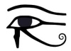
I'm going to address the sexual imagery then make another pass through to spotlight the Eye of Horus.
Two brands in this class (middle of the collage) were introduced earlier in the series, Gucci and Chanel (Part 35), representing a doubled G and doubled C, respectively. The first new branding in the collection I want to introduce is the doubled S representing Spire Fertility.
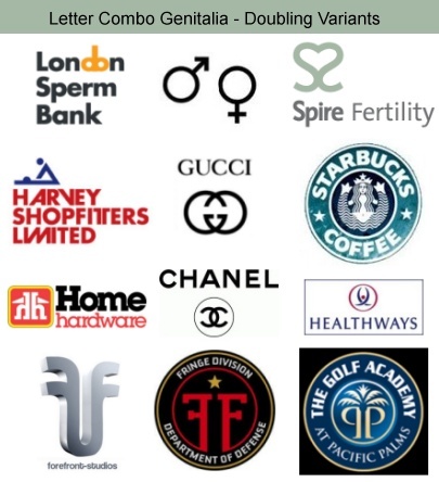 What many or perhaps most probably see in the Spire Fertility graphic is nothing more than a heart, formed by the opposing connected letters S. When you recognize the heart as a vagina with spread labia (See "The Valentine - Illustrated" collage in Part 23) you may understand how this compares to the branding of a competing and/or partnering entity, the London Sperm Bank. I present the Starbucks logo (1987-1992) in the collage underneath Spire Fertility for the sake of comparison, as well as the Healthways branding under that. Compare also the three; Spire Fertility, Gucci and Chanel. Do you see what you're looking at?
The next brand I want to introduce is Harvey Shopfitters Limited. The phallic letters presenting the male package are the two letters T stylized in the title. The phallus is pictured pointing downward. Is that really a phallus? Consider the blue elements at the top of their branding. Stick figures, copulating. The female has her arms extended over her head and the male has his hands on her breasts. The company represented isn't in the porn or sex toy business but rather provides "fit-out and refurbishment services." Again, are the stylized letters T picturing the male genitalia? What other explanation could reasonably be offered?
Below that, the doubled opposing letters h in the branding for Home Hardware pictures the male member "buried to the hilt," comparing to the redbox brand's DVD packaging graphics.
Below that (at bottom left in the collage), the doubled opposing letters f representing forefront-studios pictures the same. Foreskin-studios?
To the right of that at bottom center, a similar doubled opposing letters F appears in a badge emblem featured on Fringe, a recent (2008-2009) Fox Network TV series. That show may become the subject matter of an upcoming series on this blog because it's so richly signaling! The Fringe Division DOD emblem has more than one level of interpretation. On one level it compares to the brand at bottom right, the last to be introduced here. I'll return to the Fringe Division imagery in a moment. I feel like I should apologize for this one in advance because, after seeing it, you'll probably wish you hadn't. Pacific Palms is a golf resort, hotel and conference center in the Los Angeles area. Their logo features the male package as two opposing letters P, disguised as a palm tree. Compare their graphic to the adjacent Healthways (See Part 29) and Fringe Division imagery. I still find myself muttering, "That's just so wrong!" I have to think that, somewhere on their Web site they must surely be offering special discounts to member proctologists.
Ok, if you're sufficiently recovered from that experience, take a look at the Fringe Division emblem and consider it from another perspective. This one is like the Healthways graphic in that it presents both backside and front side perspectives.
Consider the F as signaling the female gender. What you're looking at is like what would be seen during an exam at the OB/GYN clinic, and also what can be considered as a diagram from a frontal perspective. See the star variously as the urethral opening, glans clitoris or cervical opening. See the red inner circle with its opening at the bottom as the vagina. Where you read "Fringe Division" - think - fringe = pubic hair. Where you read "Department of Defense" - think - chastity belt or, perhaps hymen. Compare this to the Spire Fertility, Starbucks, Chanel and even the Gucci brands.
This sexed-up branding is also signaling the Eye of Horus, which is one with the serpent's reproductive "Mark of the Beast" scheme.
Most obviously, the concentric rings of the Fringe and Pacific Palms appear as eyes. The Pacific Palms version features a dot-in-circle sun symbol with its "anus bindu," signaling the sun god Horus. That feature also appears as a third eye bindi between the testicular "eye balls." Palm fronds form eyebrows from this perspective. Directly above the bindi is what must be the royal crown, a very common feature in occult symbols that signals the anti-messianic king, Horus. The orange star of the Fringe Division emblem should likewise be identified as Horus; Mr. Star-on-top, Mr. all-seeing eye capstone, perhaps crowning at the cervix as about to be birthed by Isis. The branding imagery of Harvey Shopfitters Limited has much more going on than just graphic sex! The blue delta above the red AR is the capstone of a pyramid. That blue on white procreating delta man is the heavenly divine capstone Horus! The pyramid body is composed of the transformed children of Adam, the red (Adam = red earth) and white (divine) pyramid suggested by the peculiarly angled letters A and V. The A and V are very frequently used together to signal, as paired opposing deltas, the sons of god (A) with the daughters of men (V). Between the signaling A and V appears the R, a letter so commonly used to signal Horus.
The letter R that saturates our environment in the Rx pairing bears the value of 18 as the eighteenth letter of the alphabet, leveraged for the 6+6+6 connection to Revelation 13. The H seems to stand apart. H is for Horus, of course! Another letter pair is called out in the word "Limited" that speaks to me of the arrogant declaration "I Am" - IM. "I will be like the most high" (Exodus 3:14 and Isaiah 14:14)! The "IM" call out also imports a 9 and 13. If you've been following the series long, there's no need to elaborate on what that signifies!In the forefront-studios branding, the pronounced gradient lighting effects with some wash-out highlighting may be recognized as a commonly seen illumination signal, the activation of the Eye of Horus, pineal gland and anja chakra. Forefront, like foreskin and also, forehead!
I don't see Horus in Spire Fertility's branding, beyond the mint color softly hinting at Osiris green. I do, however, see the S pairing as serpents, coming together as DNA windings and as one with the female to signal the union of the sons of god with the daughters of men.
 Home Hardware branding features the letter H centrally, and H is for Horus. The logo as white on red ringed by yellow presents a rounded square (the shape signaling Hermaphrodite and Baphomet that creates cognitive dissonance) sun with a couple of illuminating rays. Horus. If you explore their Web site you'll discover the set of images I present at right.
 Compare the aeroplan title to the London Sperm Bank's. The prince of the power of the air does indeed have a plan for you and I, a sort of "aeroplan" with reproductive activity in mind!
There's a Beaver sub-brand. Slang. Consider the positioning of the male counterpart of the parent logo. Subtle? No. Not really. It's directly under the AV pair too! Hey, is that beaver in estrus?
How about the image on the bottom. Our bodies are as earthly tabernacles, our dwellings, our homes. You already get the "Home hardware" reference to the male body's genital "hardware," right? Ok. Now, do you get the home ownership reference? Do you really want to be helped by those who want to own your home, your earthly tabernacle - you?
Are we offended yet? Horus wants to own you, my friend! The devil is bad. He's got the authority to do what he's doing. Praise the Lord who opens our eyes to expose the spells of the wicked who prey upon the ignorant and rebellious, who knows every weapon forged against us. He is our very shield and buckler! Y'shua HaMashiach, Jesus Christ, the son of the living God has a plan, and it is working!
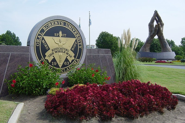
 Just like that one, this version at the ORU entrance has the glowing eye on the capstone. See his head as the pupil of the eye, with his upraised arms forming the lower frame. The upper frame is implied, and the illumination of the eye is represented by the SPIRIT flame. That's the Eye of Horus that is also known as the third eye. Since the eye is on the triangle, it's the third eye, of course.
 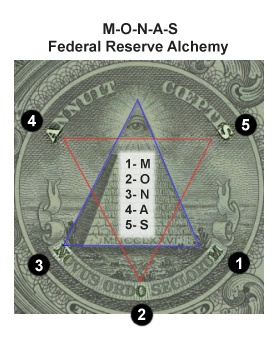 This style of encryption that requires something of a radial decoder ring compares to what's found on the dollar bill's great seal, illustrated in this image where “Monas” is produced.
 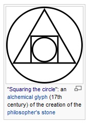 The triangle-in-circle form is very popular in the arcane literature associated with alchemy. It's equated with squaring the circle, which is a cryptic reference to ritual sodomy, the means by which initiates are illuminated with the SPIRIT flame of the sun god. Another expression of this same triangle-in-circle sodomy is provided in the famous illustration of the Philosopher's Stone, Atalanta Fugiens.
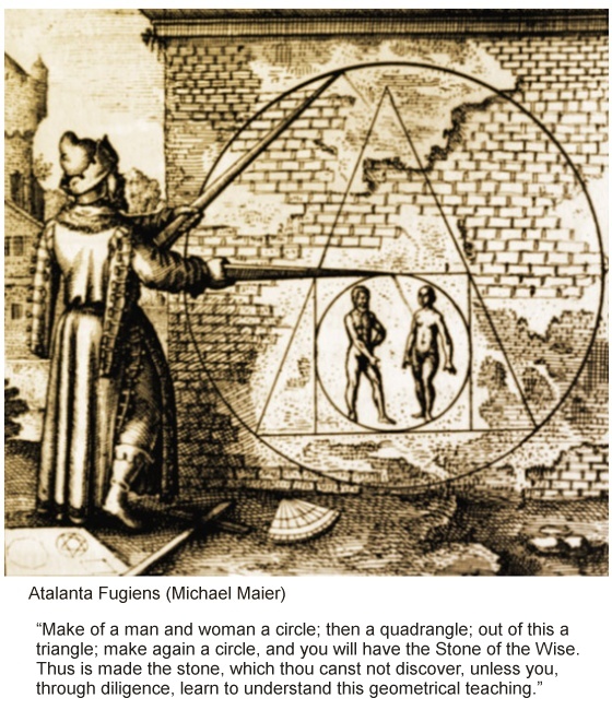
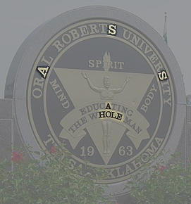
 The square is suggested in the lines of the sides of the larger word “EAGLE” centered over the smaller “DAYS.” The compass form is called out in the highlighted A. The G typically found inside is at the center of “EAGLE.”
 In the Eagle Days promo imagery, “GAY” is highlighted, as I illustrate in this graphic. That's befitting the sodomite feathered serpent god and his worshipers. For the Code 33, “GAY” is 7+1+25=33! Right. No kidding.
 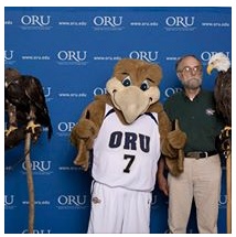 See how the bracketing letters E of “EAGLE” are overhanging “DAYS.” EE=33! The golden eagle mascot silhouetted in the A is Apollo, Amaru. The A is the truncated pyramid (the body of Horus) with an assumed capstone, the head of the body, Horus. The relative positioning calls out the AL and RO in the capstone. AL=1+12=13 and RO = 33.
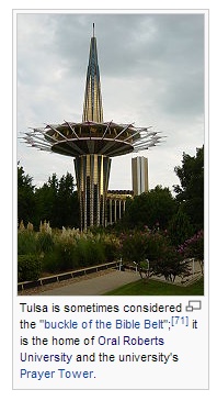 Why do they have a prayer tower, and why is it in the form of an obelisk like phallus piercing a sun anus? Nothing good comes of any of that!
 What is less evident and completely devious is what the creation of the little line separating the A accomplishes. The esoteric solution to the 47th problem of Euclid is invoked because we have a 3 (ORU) 4 (LIVE) and 5 (ALIVE) with the L as a 3.4.5 right triangle. The 5-alive is Horus, who is by symbol magick being brought to life. So, A and LIVE, declaring, Apollo or Amaru, LIVE!
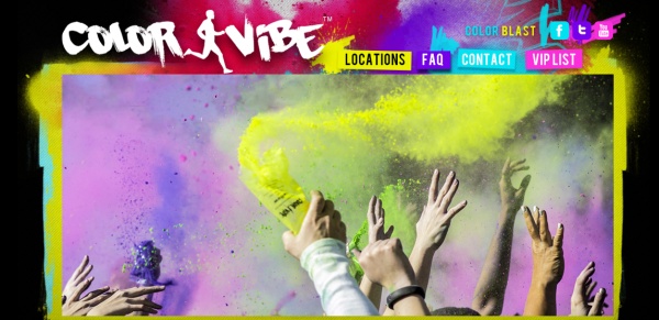
 The website is thecolorvibe.com. Observe: “thecolorvibe” contains 3+5+4 characters. Are we catching on?
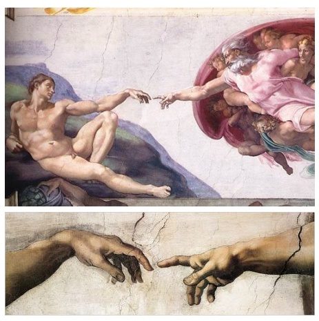
 It is the Egyptian sex magick bridge, that is the production of Horus through the union of Osiris and Isis, manifesting the heavenly in the earthly. Seeing what I see, I really have to assume there is a DNA transforming aspect to this activity, supernaturalism of alchemy, a bioforming mechanism of some kind.
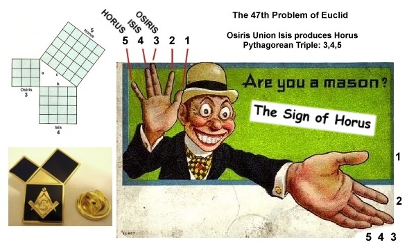
 This ad is for the DC event expected in September. Pittsburgh's event will be tomorrow, for most of you reading this, on 7/13/13. Ruckus is billed as The Nations Premiere Obstacle Race Series. Plenty of orange is featured in the marketing, suggesting what is probably meant by the name is a letter swap of an F for the R. Is there any support for that sodomite interpretation? The big orange “squared circle” “Register Now” button. How about running through the tires, as symbols of the black hole sun? How about
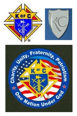 There's a lot going on in the background in this remarkable season that I can't really blog about, at least not yet, but I'm going to continue posting such content as I am able.
 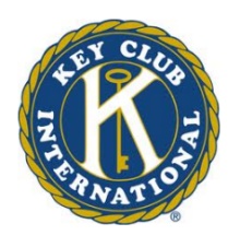 Another charitable organization with a KC branding is the Key Club, the high school arm of Kiwanis International. I decoded the Key Club and Kiwanis imagery just last year, in
  In their logo, I note how they position the title words so that the k and c pair up, and right next to them the i and o pair up, IO or Helios, the sun god.
  The girl's posture speaks to me of the Vitruvian Man, another esoteric classic signaling ritual sodomy.
 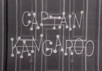 I'm going to page back to a CK brand to pick up this example. Captain Kangaroo was another innocent looking Code 33 brand targeting children and their figurative dots. I wrote about this famous character and his children's show in
 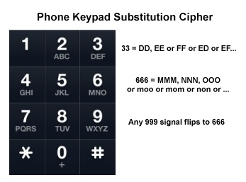 The keypad can be used to convert number strings into to letters, like illustrated in this recent post:
 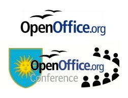 Nice birds, right? Each bird is a 3, signaling 33. Each O transforms to 6 on the phone keypad, complementing the Code 33 with a 666.
  The leveraging of the triple O in their legacy branding is subtle, but that goes away in what is now Apache Open Office, which descends from OpenOffice.org and IBM Lotus Symphony. Did they discard the triple O and lose their 666 symbolism? No, they actually strengthened it! The 33-birds appear inside a circle that doubles as a sun (like gulls at the beach) and as a third O. Clever design. At present, the TM (which may at some point become a registered trademark symbol) is another 33 in English gematria (20+13) that balances the 33 of the birds in the sun.
 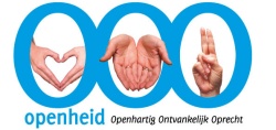 Here's a triple O brand augmenting their keypad coded 666 with a trio of hand signs. The heart is a butt and sodomite gateway symbol. The hands in the center present another butt, like the heart - bottoms up! The hand sign on the right has two fingers joined, presenting a Horus hand by the union of 3-Osiris and 4-Osiris. Openheid ~ Open Eyed ~ Horus Eye Open!
 The “Only Olive Oil” logo features the triple O as 666. Each olive is an eye, looking up. Three eyes ~ third eye. On a more subtle level, the eyes are as dotted letters “i,” with the symbol value of 666 adding redundancy as each “i” is a 9 that flips to 6. The Horus Eye is signaled on another esoteric layer as the olive is a coded reference to the character of excrement as described by the mark-savoring Marquis de Sade. Olive oil is used by sodomites as a lubricant.
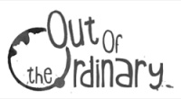 “Out of the Ordinary” complements their OOO-as-666 logo with an Ouroboros-like ring. O is for Ouroboros. The article “the” provides the gematria value of 33, as 20+8+5, a Code 33 signal supplemented by the little word “of” (RAS: 12+21). Given the graphic debris left behind on the right side, the messy O has to be seen as the anal Orifice, another OpenOrifice and sodomite gateway. So, the symbolism here really isn't anything particularly out of the ordinary, is it?
 Another triple O brand featuring the Ouroboros is popular here in Pittsburgh, the Whole Foods Market. OOO~666. W(hole)F(oods) provides redundancy as the W is a rotated 3 and F has the gematria value of 6. Three sixes. I've decoded this brand before (Search this blog for it), describing their stylized veggie Ouroboros O as a plumed serpent. Their store brand, the 365 brand, is magickal, picturing the 4 seasons and magickal elements.
 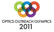 The Optics Outreach Olympics is a triple O 666 signaling brand that layers this on their 2011 Olympic Rings design. Search this blog for what that means. It's related in meaning and honors the same god. Five rings ~ Horus.
 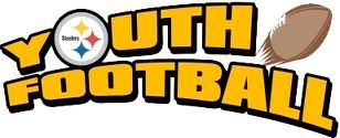 The Pittsburgh Steelers have branded their Youth Football with special triple O 666 symbolism. The Steelers logo is a variant of the alchemical triangle-in-circle.
  It's a “three things and then a fourth” symbol, which is a key message I haven't mentioned in a long time, a deeply hidden time symbol. It's also a 3.4.5 symbol of the production of Horus. Three stars and four objects are inside the circle, which is the fifth element that represents their sum. As a sodomite gateway symbol, that Horus Eye is matched to the football-as-dung being launched from the big truncated pyramid and Apollo-Amaru-Anus. (
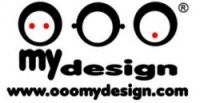
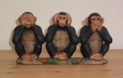 Each O represents a monkey face of the moral monkey trio, “see no evil, hear no evil, speak no evil.” Who are these monkeys, really, but those who don't perceive the evil before them, who are enchanted by the spells that cover such as this magickal symbol? The first monkey has two eyes. The registered trademark symbol adds the third eye, the Horus Eye.