
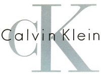
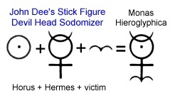
 After a consideration of how 3 and 11 signal 33 as factors, the next level of obfuscation involves the substitution of letters with the values of 3 and 11. This is a pretty big class with lots of examples. Here's some notable CK versions.
 First up: Calvin Klein. I chose this particular logo variant because it illustrates more levels of Code 33. The cC adds a layer. The word “in” is position at the correct anatomical location for demonstrating a side view of the Vitruvian Man action, sodomy. Calv-IN-Klein. Inside the K are a pair of opposing glans penis, Apollo's arrowheads.
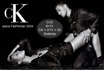
This catalog promo from 2004 features a couple demonstrating the position sodomites call the butterfly.
C & K presents a similar image, identifying the sun god's butt with orange rays. They rotate this, which suggests the form to us as a child, with the C as their head, Horus Eye illuminated.
 The C is a 3 and that's the third eye. They C, you see. Code 33! Note, these CandK folks are pre-schooling professionals, since 1907. Pre-school age, actually 3-4 years old is prime for programming chosen ones and multiples farmed for psi powered alters. Just how many Illumined slaves do you suppose have been programmed with ritual sodomy since then? SRA mind-control programming goes way back long before MK-ULTRA and Mengele.
 While we should expect that kind of thing from the fashion industry, and really from those organizations parents trust their children to, we folks tend to let our guard down around the comfortable safety of the diner.
 The pair on the left side of this collection of Country Kitchen logos each conceal an X up top, presenting the sun god's mark instead of the obvious sun graphics of the pair on the right. The version at upper left presents an X-in-a-box pyramid of the Mayan style, with a 3.4.5 feature in the count of elements (which includes the yellow X). That peak at the top is for squaring the circle, which also suggests a pyramid capstone on the oval eye of Horus.
 The version at lower left features a weather vane with a rooster over the X, the fowl associated with Hermes. Validating that, the Hermetic Maxim is emphasized with another image of the rooster below, as above. The rooster is a herald of the dawn of Horus as crowing to announce the coming rise of the sun. I should add here that this is actually modeled on the biblical symbolism of the rooster crowing to announce a resurrection. (See The Bridegroom and Bride - Two Years and Counting)
At upper right, the sunny flower conceals a subtle CC, a great light rising out of the green butt. At lower right is the form of the squared circle, and sunrise.
 The leg of the K reaches out to mark the male bindi in the circle and create the classic target style sun symbol. The C and K touch, bonding them together, and at their intersection an X is formed, the sun god's mark.
 The Candy Kitchen is another opportunity for some sneaky Code 33 signaling. The K appears to be sodomizing the C, with the yellow star (angel) covering the action. That's Horus, called out as it dots the “i” of Horus. “The”=20+8+5=33. The candy cane look underscores it with that subliminal CC allusion.
Below that, Candy Kitchen features a sun god graphic. The sign shape pairing adds to that big circle a square, to repeat the signal made as the straight lined candy wrapper squares the circle of the sun, just in case we missed all the squaring done by every ray. It looks to me like a 3 is concealed in each wrapper of the other candy. They are arranged to suggest the male package, near to the sun anus. Chocolate Covered. Right. A CC class of Code 33.
 Chocolate, a metaphor for excrement. Strawberry, slang for an abused anus.
The Circle K branding is a simple CK graphic. The leg of the K kicks out to square the circle. Red and white ~ Illuminated Adam-kind ~ Code 33!
Sometimes, the CK appears in a more subtle fashion as with Jack in the Box, which has been leveraging their Occult imagery to great effect. On the left you see their earlier branding. The peculiar way they merged the X into the O of “BOX” is one squaring of the circle. The presence of the registered trademark directs us to perceive that image as a wedjat, the seeing eye of Harmerty.
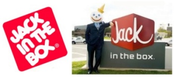 Another squaring of the circle symbol is the rounded corner box. The CK of Jack isn't highlighted but you can see it as another circle being squared in a way suggestive of sodomy, with the joining of the letters producing another X, the sun god's mark.
 If you follow their lead and keep tipping the off-balance box to the left, you'll have a pair of them on top, XX, or 33, flanking “the” (20+8+5=33). If you accept that the OX is a wedjat eye, assume that the CK-formed X is another eye, and the the E is the third Eye between them!
 When double Xs line up the Masonic square and compass is implied.
In the current branding, pictured on the right, the ck is given rather conspicuous attention by wrapping it around the corner. Why? Code 33! A phallic package is also suggested (like with The Candy Kitchen logo above). You can learn more about the decoding of this brand here and here.
The Jack of this brand has a round head. Jack in the Box is the round head in the square box. Remove the eyes and smile from that circle and you have the target style sun god symbol - the sodomizer Horus!
 A jack that is the child's toy presents an X, and a jack-X in the box is a pyramid!
The CK is the secret identity of Superman, Clark Kent. He's always described as being “mild mannered,” and mm~33. Search this blog for what I've already written about some of the Occult themes I've been led to discover. I expect more will be written about this in the series focused on signs of Horus worship, but it certainly deserves attention here in the context of Code 33. If this comic book cover isn't a picture of SRA, what is it? Superman Ritual Abuse! Superman - The Man of Steel: Daniel 2 - Steel-iron + Man-clay. Small wonder that the ET man in tights is so beloved by the LGBT fraternity. Another community of fans includes ministers: Ministry Resource Site. Mystery Babylon is as Mystery Babylon does.
We leave the entertainment media behind for the real world do-gooders at Camp Kindle, but the Code 33 theme of ritual abuse remains. Their CK logo features a sun anus vortex. Three waves ~ Third Eye.
Here's an advance on Code 33 word sums: CAMP = 3+1+13+16 = 33
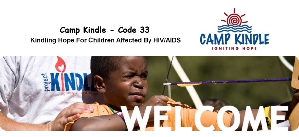
The image of the archer appears on their current home page. If you're familiar with the sodomite gateway series this scene should be pretty familiar. Fragile traumatized youth are rounded up by an organization whose branding is a celebration of all things Code 33. I'm a huge fan of genuine charity but I'm not a fan of the schemes of predators. Let's ignore the young archer's absurd technique as the pose had to have been staged for the picture (and ignore the arrow missing a feather [Hey - those folks must really squeeze every dime out of the funds received.]) and focus on the symbolism.
Apollo is the archer. The boy's one eye validates that Horus identity. He wears an orange t-shirt, a symbol of ritual sodomy. Sodomy is already in mind here, as the means of how HIV and AIDS are primarily transmitted. See how the j in “project”on the adult's t-shirt pokes the Kindle K in the butt. They seem to be making allusion to the drugstore window scene of Singin' in the Rain, when Don Lockwood poked the Mahout girl's butt with the handle of his umbrella. “J” is the letter numbered 10, a transformed IO for Helios. In Roman numerals, J as 10 is an X. Sun god sodomy. Just what they are project-ing there is clarified by the context. The torch is a classic of arcane symbolism representing the light of the sun, stolen from the heavens and brought to earth to illuminate man. The emphasized red letter I with heart flame calls out an “i” of Horus, which makes the heart-butt at the top just oh-so apropos.
“Oh, how superior is the Eye of Horus to the Mouth of Isis!” (Aleister Crowley, expressing his sexual preference.)
Some Welcome. What kind of Hope is being Ignited to set fire to that kindling?
 Finally, the last CK example is the Comfort Keepers brand, which features the heart inside an anal triangle. Find a pair of 3s in the outline of the sidewalk to support the CK code. The helping Horus hand looks like a serpent dragon head. Plus sign windows form the X in a box of Mayan pyramids. Rotate this a quarter turn and the windows frame the inside of a blue H, for Horus. The open door is the sodomite gateway, and white light spills out through the 33 to break the outline of the oval eye, squaring the circle. The sidewalk signals this is the third eye. Take your pick which eye you want to match to the Harmerty signaling registered trademark. The Hermetic Maxim transformation reveals 666 in the reflection. It all just looks so, well, nice, until you see through the delusion.
 Thank you Lord, for exposing the snares of the enemy! Soon enough, the corruption of this age will pass away, and the Lord will reveal Himself openly, Who is truly good!
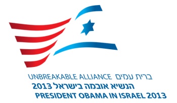 When I was led to give my attention to the imagery branding the ObamaCare program (
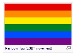 There is another famous flag with six color bands, the LGBT flag used to represent the alliance of lesbian, gay, bisexual, and transgender people, their pride and social activism. If you form a union of the red and blue on the Unbreakable Alliance logo, the colors blend to purple, a symbol of the sodomite gateway that is akin to the rainbow. The elite are sodomites and their operation proceeds strictly on the basis of their sodomite and sacrificial rituals. We noted how the text in this version begins and ends with English, wrapped around the Hebrew like a kosher Hebrew National hot dog inside the bun.
  When Nimrod was building a city and a tower, the union of builders expressed their solidarity in the rationale, “lest we be scattered abroad upon the face of the whole earth.” (Genesis 11:4) The tower of Babel has been the brand and banner of the EU for some time now. What used to be referred to widely as the Orient appears to be in the midst of some destabilazition that must precede restructuring. Things are coming together at quite a pace!
 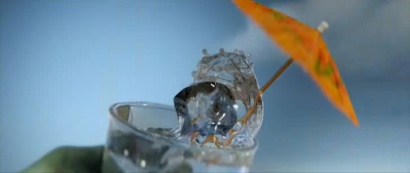 Let's continue the investigation of the transdimensional technologies being concealed and revealed in Rango's “Hail Mary” sequence. The ice cubes from the umbrella drink were crystals, cubes of crystalline structure. I'm going to be focusing attention in this post on the crystals, and it will be noted how there's plenty of overlap in the signaling rainbow, cube shape and floating terrarium gravel.
 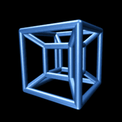 The holy of Holies, where the presence of God was established on earth, was a cube. If you relate the heavenly and earthly, the dwelling place of the Lord God resembles an ice cube. Using more precise language, the heavenly throne room with an earthly cube of contact is a hypercube, a crystalline hypercube. In four dimensions we call such a form a
  You realize the IOC (Olympics) servants of Zeus understand these things and constantly signal them, right? On the site, “Totally Looks Like,” users publish A-B comparisons of a thing in one context that looks like something in another context. Consider this comparison from
 Like The Iron Giant, this animated feature presents us with a stunning array of imagery that significantly advances the kingdom of antichrist. This movie that is widely acknowledged as “not really for children” weaves themes like triple helix DNA transformation and Nephilim resurrection artfully throughout it's comical and highly entertaining engagement. Entertaining, unless you happen to be a typical child, which in that case will be more than mildly traumatic.
  NCR.com Reveals the Mark of the Beast Plan
 The imagery that finally prompted a long anticipated return to the "i" of Horus series belongs to the now defunct Burroughs Corporation. The magazine ad from the late 60s you see here came to my attention a couple days ago, linked from RaidersNewsNetwork. (
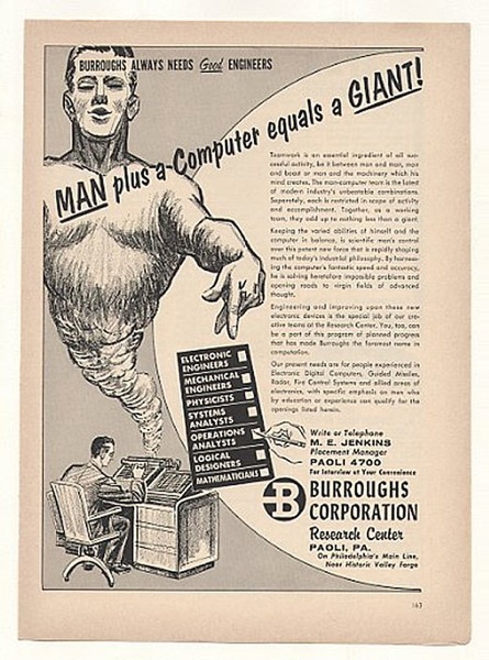 (See
(See  Notice how the company name appears on the giant's forehead like a label. What kind of giant Burroughs, or, substituting the obvious homonym, burrows? Burrow: “A hole or tunnel dug in the ground by a small animal, such as a rabbit or mole, for habitation or refuge.” Have you been following this blog? How about Horim? How about Rephaim? Djinn. The giants of Genesis 6. If you swap the logo for the name it represents, the giant looks like he just left Ash Wednesday's Mass. Let me just state the obvious: The B stands for Beast.
  The Burrows, uh - Burroughs, logo is a pretty clever device. Embedded within it are the solar wheel cross, a trident and the number 13. Rotated, it's the reproductive imagery of both male and female genitalia. Burrows. Sexual innuendo. Clever, very clever indeed!
 Completely different? OK, not really. It's more variations on the theme. Beings rising from the underworld, from caves, burrows, etc.
  Bats flying out of cave into the light? Check. High buildings of city? Check. The bat man aka dark knight (Nephilim Giant cave dweller) rises.
  Underworld is a popular vampire film franchise that has a lot in common with the Twilight series I mentioned in the last post. They have female leads and feature blood sucking vampires and shape-shifting flesh eating werewolves. The fourth installment in the Underworld series is Underworld: Awakening, set for release in 2012. The promotional blurb? Vengeance Returns.
 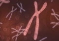 of openly Zeus worshiping Olympism is coming very soon, with the torch planned to be lit from the sun on Mt. Olympus this coming May.It has just been announced (on Pearl Harbor Day, no less) that Underworld, yes, Underworld, will have a significant role.
 If you've been following this blog for a while
  By the way, if that makes sense to you this company's branding should too. Their products lubricate and so does their branding, reducing friction that hinders the coming mark, through the effectual spells of symbols. The underworld activity that brings forth such as the UNION 76 (7 united to 6 yields 13) branding has been around for a very long time.
 The coming Horus Beast will not be saving the world despite the constant implication.
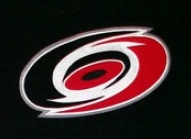 The Carolina Hurricanes NHL hockey franchise has a powerful logo. At a glance, it smacks of the ubiquitous yin yang symbol - the "balance" or fusion of the opposites that is, bottom line, about the union of the sons of god with the daughters of men. Their striking brand is the classic Sun/Horus target symbol, the bullseye bindu inside an encircling ring - the male inside the female. This swirl eye is also presenting the two digit number of the beast transformation, 69. (See
  It's the full count of three packages of 23 chromosomes each!
 When the Carolina Hurricane target is positioned on the heart, it's magick. Simply magick. That's with a k, as per Aliester Crowley's distinction. How appropriate that the promotion is to benefit children!
 If you decide not to celebrate your next Valentine's Day at Starbucks before you head off to catch the Carolina Hurricanes, I'll understand.
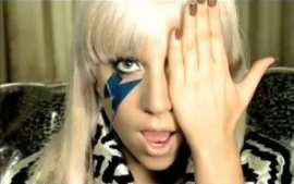 This signals that it's all about the hidden eye, the eye of illumination. In the image shown here, the other eye is adorned as another version of the eye of illumination. The lightning bolt is the weapon of Zeus, coming not from the clouds but from her eye. It's black, a dark light. This eye is the lamp-eye referenced in Luke 11:34, the evil eye, the one that darkens the body as with a darkness or anti-Light. The darkness of this illumination is functionally a weapon like the lightening bolt that is the weapon of Zeus.
 heard
heard  By what argument does Touchdown Jesus not qualify as such a likeness? The statue qualifies, the cross qualifies, and the label "INRI" qualifies! While there's a lotta qualifin' - there's a whole lotta justifyin'! This is not "rocket surgery," or "brain science," folks. Ask any child young enough to still think for themselves and honest enough to speak their mind. Do you see how this image itself is even high in the sky (in heaven above) and "on the earth beneath" AND "in the water under the earth"?