
16 “Now no one after lighting a lamp covers it over with a container, or puts it under a bed; but he puts it on a lampstand, so that those who come in may see the light. 17 For nothing is hidden that will not become evident, nor anything secret that will not be known and come to light. 18 So take care how you listen; for whoever has, to him more shall be given; and whoever does not have, even what he thinks he has shall be taken away from him.” ~ Luke 8:16-18
You'll see in this post how the Walgreens Pharmacy brand is actively spreading pharmakeia - even aside from their being in the pharmaceutical and cosmetic industry. It's another brand that, like redbox, leverages the color red in the Valentine's Day season to enhance its own brand identity. With this color and some distinctly related symbolism they celebrate the goddess of love, of magic, the bee goddess as queen of heaven, and the scarlet woman, the great harlot, Mystery Babylon the Great. This brand's imagery is very ancient and powerful, signaling even the Eye of Horus that is at the very root of their industry.

This ad that I found on their Facebook page establishes their intent, to those of us who can decode it, and the subtlety of the layering enhances the mind-control factor and raises the harvest of ritual (demonic spirit) energy gained from their magickal practice of theurgy. We'll decode that shortly.
The branding of Walgreens always includes their stylized W. They brought a lawsuit against the Wegmans supermarket chain in 2010 with an assertion that the stylized W they were using was too similar. Wegmans yielded to their demands.
On a very fundamental level, the stylized W they are so protective of features the ancient symbol of the mark of the beast, the heart of the sigil of Nodens, god of the abyss, which is the crossing of circles. The form is evident in the looping vesica piscis-like center of the W. It's the union of the “double U,” as we say the letter. As signaling the union of the X and O, this is claimed by those who should know to represent a divine sexual union and to establish the celestial throne of the goddess. Additional to the loop's crossing circles, the mark hanging off the left side creates another instance for redundancy, effectively crossing the arc of a circle with a potent half Tau on the circumference.
The Walgreens brand has been identified with the color red and the image of a blue mortar and pestle with white stars (replaced with an update in 2006). That version has a subtle patriotic look, with white stars on a blue field, and with the color red it's a theme that resonated with the slogan of their branding: The Pharmacy America Trusts. Given that Walgreens is today the largest drug retailing chain in the United States their slogan made a legitimate claim.

It makes good marketing sense to signal the waving of the national flag to attract the patriotic. At the root of that attraction, if you have eyes to see it, is how America's loves Columbia, Liberty and Freedom, all being national goddess identities. The District of Columbia is on a parcel of land that is part of a grant from Virgina and Maryland. VIRGIN MARY LAND. This patriotic theme is very much one of the goddess. The essence of Walgreens' branding goes beyond the patriotic sense - reaching right on through to the goddess.
Here's what
FamousLogos.net (DESIGN ELEMENTS, HISTORY AND EVOLUTION OF WALGREENS LOGO ) has to say about it.
“The Walgreens logo is one of the most popular logos in the pharmaceutical industry. It has served as a critical aspect in the company’s success and continuous growth. The current version of the Walgreens logotype was introduced in 2006 when the company decided to simplify it and remove the cup symbol featuring fifteen stars, which was a prominent feature of the old corporate logo which typified “magical healing”.”
Note the observation that it typified “magical healing.”
In updating their brand imagery Walgreens dropped the blue color and the star motif but retained their essential stylized W, the dominant red color with the white, and the imagery of the mortar and pestle. Not that many folks these days can identify the mortar and pestle beyond linking it with the Rx, like you see in this screenshot of an old fashioned drugstore from a scene in the animated feature from 1999, The Iron Giant. See it on the window glass?
The mortar and pestle have been used for thousands of years to grind roots and herbs into powder and to mix ingredients together. These may be used in the visual arts for making pigments, or by chemists, cooks - or witches. As FamousLogos.net observed about the Walgreens brand, they may be used for “magical healing.” They are also used for other magical preparations like charms and potions.

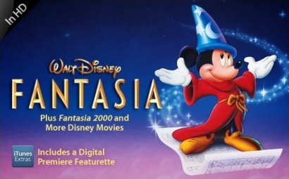
In our culture, Disney has famously used the flowing stars motif to represent magic in such popular films as the classic, Fantasia. Micky Mouse, the Sorcerer's Apprentice, wasn't doing any magical healing but he was certainly casting a magic spell.
What does the Walgreens W signify? One one level,
W is for Witch, or Warlock or Witchcraft. Here's a collection of images found when I searched for
witch mortar pestle.
Witches still use the mortar and pestle in their homes for the same reasons they always have. These tools of the craft are often inscribed with magickal symbols. And, so is the one Walgreens has presently branded themselves with.
W is for Witch.
Walgreens is a pharmacy. The word comes from the Greek, pharmakeia. The word is used in the Bible and is usually translated as sorcery or drug spells, depending on what version you're looking at. (See
Pharmaceuticals -The Sorceries of Babylon for more insight.)
19 Now the deeds of the flesh are evident, which are: immorality, impurity, sensuality, 20 idolatry, sorcery (pharmakeia), enmities, strife, jealousy, outbursts of anger, disputes, dissensions, factions, 21 envying, drunkenness, carousing, and things like these, of which I forewarn you, just as I have forewarned you, that those who practice such things will not inherit the kingdom of God. ~ Galatians 5:19-21
21 Then a strong angel took up a stone like a great millstone and threw it into the sea, saying, “So will Babylon, the great city, be thrown down with violence, and will not be found any longer. 22 And the sound of harpists and musicians and flute-players and trumpeters will not be heard in you any longer; and no craftsman of any craft will be found in you any longer; and the sound of a mill will not be heard in you any longer; 23 and the light of a lamp will not shine in you any longer; and the voice of the bridegroom and bride will not be heard in you any longer; for your merchants were the great men of the earth, because all the nations were deceived by your sorcery (pharmakeia). 24 And in her was found the blood of prophets and of saints and of all who have been slain on the earth.” ~ Revelation 18:21-24
I note that a millstone is for grinding, like a mortar and pestle. So, the pharmakeia deceived all the nations, which is to say, cast magical spells that deceived. Deceiving spirits are being deployed and employed. The agency responsible is named as the great city Babylon, in verse 23 above. Verse 24, again, declares:
“And in her was found the blood of prophets and of saints and of all who have been slain on the earth.” Blood. Lots of blood. Blood is red. Walgreens Pharmakeia red.
1 Then one of the seven angels who had the seven bowls came and spoke with me, saying, “Come here, I will show you the judgment of the great harlot who sits on many waters, 2 with whom the kings of the earth committed acts of immorality, and those who dwell on the earth were made drunk with the wine of her immorality.” 3 And he carried me away in the Spirit into a wilderness; and I saw a woman sitting on a scarlet beast, full of blasphemous names, having seven heads and ten horns. 4 The woman was clothed in purple and scarlet, and adorned with gold and precious stones and pearls, having in her hand a gold cup full of abominations and of the unclean things of her immorality, 5 and on her forehead a name was written, a mystery, “BABYLON THE GREAT, THE MOTHER OF HARLOTS AND OF THE ABOMINATIONS OF THE EARTH.” 6 And I saw the woman drunk with the blood of the saints, and with the blood of the witnesses of Jesus. When I saw her, I wondered greatly. ~ Revelation 17:1-6
This woman sits on a scarlet beast, clothed in purple and scarlet. The color, scarlet, is a bright red. Those who dwell on the earth are made drunk with the wine of her immorality, and wine is typically red. Verse 6, again, declares: “
And I saw the woman drunk with the blood of the saints, and with the blood of the witnesses of Jesus. ” Again, blood is red. Walgreens Pharmakeia red.
The branding of Walgreens is identified with the sponsor of pharmakeia. On one level,
W is for Whore, the harlot with the golden cup who is drunk on the blood, Babylon the Great.
Cosmetics that are used for beautification represent a very significant part of the Walgreens business, and the mortar and pestle have long been used for those preparations. Where did these ideas and practices come from, and where does this all lead? Have you read Genesis 6? The book of Enoch has more to say on the subject.
1) And they took wives for themselves and everyone chose for himself one each. And they began to go into them and were promiscuous with them. And they taught them charms and spells, and they showed them the cutting of roots and trees. 2) And they became pregnant and bore large giants. And their height was three thousand cubits. 3) These devoured all the toil of men; until men were unable to sustain them. 4) And the giants turned against them in order to devour men. 5) And they began to sin against birds, and against animals, and against reptiles, and against fish, and they devoured one another's flesh, and drank the blood from it. 6) Then the Earth complained about the lawless ones. ~ Enoch 7
1) And Azazel taught men to make swords, and daggers, and shields, and breastplates. And he showed them the things after these, and the art of making them; bracelets, and ornaments, and the art of making up the eyes, and of beautifying the eyelids, and the most precious stones, and all kinds of coloured dyes. And the world was changed. 2) And there was great impiety, and much fornication, and they went astray, and all their ways became corrupt. 3) Amezarak taught all those who cast spells and cut roots, Armaros the release of spells, and Baraqiel astrologers, and Kokabiel portents, and Tamiel taught astrology, and Asradel taught the path of the Moon. 4) And at the destruction of men they cried out; and their voices reached Heaven. ~ Enoch 8

They, the sons of god together with the daughters of men, bore offspring, because they had a reproductive agenda. They would have used tools like the mortar and pestle to do the spells, cosmetics and colored dyes, according to the ways of Azazel, Amezarak and Armaros and their fallen companions.
Because of the nature of this material I'll offer a caveat. If you're easily offended by descriptions of imagery that is fundamentally graphic, you're probably not going to want to see what's on exhibit here.
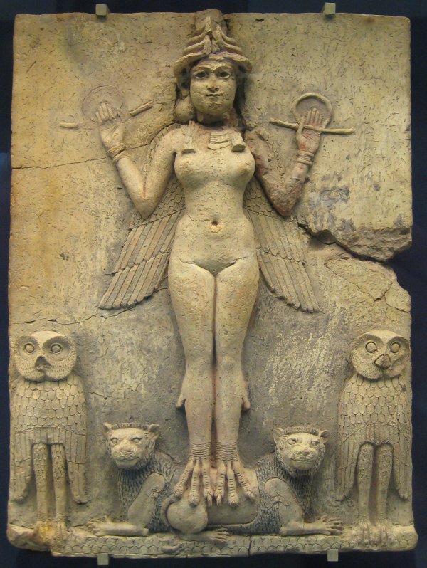
Here's what the W of Walgreens red and white branding represents, alongside Witch and Whore. With features of what's known as the divine feminine and the goddess, the W is an idogram. The stylized W pictures the female with her rounded hips, the yonic loop as the vagina and the bottom as her bottom. (As sexual imagery, the mortar is symbolic of the womb while the pestle represents the phallus.) As another ideogram, it's a classic! The W pictures the bent elbow pose that has been identified with the goddess Inanna from ancient times. This is very, a very common symbol in media.
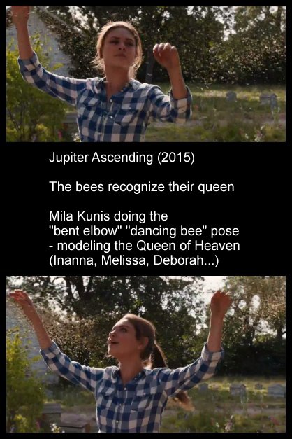
The queen of heaven has a beehive hairdo/hat/crown, bee wings, and the bent elbow pose suggestive of the dancing bee that is easily recognized as the basis for the goddess modeling W. For other examples, remember this post from 2014, with the hard-to-forget and imaginative Virgin America safety video?
Part 5 - Hidden Signs of the Goddess - Awareness Ribbons and Dancing Bees. In 2015's Jupiter Ascending, Mila Kunis played a character who was recognized by the bees as her queen. That was given plenty of attention because it was an important part of the plot development.
What was given no overt attention at all was that her bent elbow gesturing during the scene where she kind of conducts and dances with the bees is itself a symbol used to identify the ancient goddess. They were carefully
NOT TELLING US about that, covertly, because it's an Occult magickal element of their theurgical symbol work.
That the W is leveraged by Walgreens as the goddess symbol is supported by their Valentine's Day Facebook promotion, so let's decode it.
Their iconic W appears on their “corner” graphic. The W is the bent elbow dancing bee pose. Why do you suppose the boy wears a sweater like a striped bee? Why do you suppose he's gesturing with a bent elbow? It naturally supports the goddess theme! Like the red, on red. To most folks, the stylized heart means love. We see a sign that looks like, “I heart NY” but we interpret it to say, “I love NY.” The little boy is kind of like Cupid. He's a little older than the customary cherub figure - and clothed - but he's blowing hearts like kisses to disperse them which is akin to shooting arrows. Cupid, Eros - some consider him to be the son of the goddess of love. Like the stream of stars in the Walgreens former mortar graphic, the stream of hearts suggests the magickal spell casting of love potion pharmakeia, akin to Cupid's arrows.

The designers set the W ideogram upon the stylized heart ideogram, both being yonic or symbolic of the female genitalia - but it's not all about the divine feminine!
They opted for the updated branding of their corner graphic. This one resembles two adjacent faces of a cube, probably to represent a corner, because their current slogan is: “at the corner of Happy and Healthy.” (And, I can't help but see in this the emphasized double H signaling of “Heil Hitler,” betraying an undercurrent of Neo-Nazi support for Hitler and his ideals. Still trending, BTW!)

With a few more observations it becomes rather obvious why they chose this corner version of the logo and why it was placed where we see it on the promotion's stylized heart, and this exposes a key essential layer of symbolism
at the heart of their precious stylized W!
So far in this post, no mention has been made of one of the fundamentals of the Adversary's mechanisms of influence and control, ritual sodomy and the illumination it brings - but here it is! In two dimensions, their corner graphic is composed of a square and a triangle. With an understanding of the stylized heart shape as picturing the butt, the positioning of their corner graphic places the triangle element where we might expect the anus. The triangle signifies the anal triangle. Get it? The ideogram of the stylized W as hips and a bottom supports that of the heart as butt. The straight sides of the square square the circles of the halves of the heart. The square itself, as seen in its larger and independent versions, has a pair of rounded corners, and a rounded square is the squared circle, signaling ritual sodomy. Consider the view of the cube's corner. It's seen from below, so we're seeing the triangle from a perspective as through the bottom.
Think, bottom, anatomically. Through the bottom. SEEING through the bottom. With the eye, seeing.
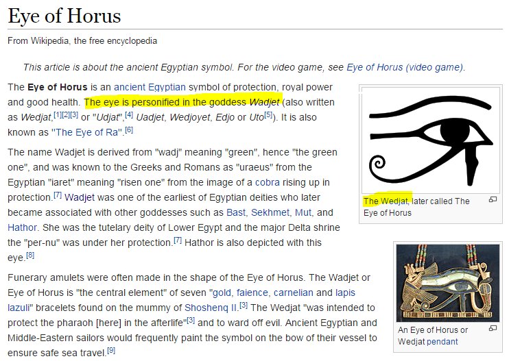
To make this more plain, that it's anatomical in nature. They add the Registered Trademark to their brand's corner graphic. The Registered Trademark symbol, as I have documented several times over the years, is the darkened moon eye of Harmerty. It's not mandated, legally, but is added to enhance the Occult power of the design. Where's the seeing sun eye of Horus that matches to the little darkened eye? The stylized W actually resembles an eye, with the loop as a reptilian or feline pupil or iris. The serif-like flourish embellishes it to suggest the typically stylized eye of Horus. The anus is known to those on the left-hand path as the Eye of Horus.
The Walgreens Valentine's Day Facebook imagery features a little boy because the innocent young boys are the primary targets of the pedophile sodomites who exploit every opportunity to elevate themselves in the company of their gods by targeting the innocent to acquire their qualities, supernaturally. The ad copy reads, “Make hearts burst with this adorable DIY Valentine's Day card idea!” The idea is about ritual sodomy programming, which is trauma-based. To make hearts burst is, in their coded language, to make butts burst, which is the horrifying reality of what the handlers do to their adored young victims, who are typically 3 or 4 years of age, or even younger.
So, what is the meaning of the iconic Walgreens W?
W is for Wadjet and Wedjat! As Wikipedia indicates, the eye is personified in the goddess, Wadjet. The eye is the Eye of Horus!
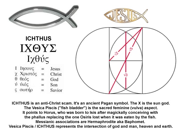
The form of the stylized W conceals what you may now recognize as the fish symbol, the ICHTHUS. This fish represents the fish that ate the phallus of Osiris, and implies that very phallus of Osiris. In the butts, of the W ideogram's hips and the heart ideogram's butt.
Sodomite ritual.
The Illumination produced through that foul practice is signified by the color white. It had formerly been my custom to document this regularly, and lately, not so much, yet the combination of the white and red does signify the red-daughters of men made white-divine.
We've already considered the evidence for the Walgreen's brand's exaltation of the goddess under many guises and with many symbols.The iconic Walgreens W is for Witch, and Whore, and the stylized form pictures the divine feminine and the bent arm pose of the bee goddess queen of heaven, and the magickal phallus of Osiris. The Eye of Horus has also been documented as present in the branding. The W is for Wedjat, to be sure! How familiar are you with Walgreens, or with any other pharmacy, for that matter?

If you haven't seen the sign of the Rx as you approached the store or strolled through the aisles you have been living as one who walks in their sleep, deep in slumber. Rx is the ideogram for the eye of Horus, as modeled on the Peregrine falcon form he takes. You see it on the labels of prescription drugs and on over-the-counter meds as well. The sign of Rx is the eye of Horus. Rx = Wedjat. The
W is for Wedjat.
In this peculiar and very special season, recognizing and acknowledging these things in our familiar world still does matter, as does our character development. May the Lord Y'shua's favor be upon you. I pray that you will truly seek Him and His good pleasure above all else in this world. He is worthy!

 Here's an interesting development. The movie titled, 2012, is back on redbox. With such a limited capacity in their system, that redbox should bring back a film like that seems rather suspect. Is there a message in this? “2012” Back Again. Redbox has certainly had our attention with the ongoing level of Occult messaging in their brand and promotional imagery. Do they know we're going to find ourselves back in 2012? BTW - the film length of 2.38 produces a 13 as 2+3+8. Thirteen. The Mastery of time.
 It's the pharmakeia or sorcery of Mystery Babylon. I don't mean to single redbox out as one that is unique in the role they play because that's not how it is.
 Mercury/Hermes is known as a phallic god, and the arrow plays as a phallus. This arrow is magically seeding the sky with star seed. Redundancy for the phallus is provided by the redbox logo, with the db combo being a classic.

 Because of the nature of this material I'll offer a caveat. If you're easily offended by descriptions of imagery that is fundamentally graphic, you're probably not going to want to see what's on exhibit here.


 This scheme identifies the phallus as that of Osiris, or the substitute that was magically created and used by Isis to bring forth Horus. Sure, it's subtle, but that's how it works, over and over and over again - until this age is brought to a conclusion.


 I've written about this holiday more than once to expose the meaning of the familiar symbolism, and with growing insight while we continue to live in faith, hope and love in the strength of the living Lord Y'shua, who bestows upon us so generously His most excellent favor, the time has arrived for another round.
  Let's decode the Redbox imagery and bring what's really there out into the light of day.
 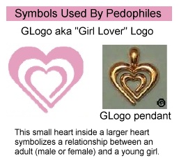 First, compare it to these images used by some law enforcement agencies to identify pedophiles. The nested hearts resemble what's called the GLogo, the Girl Lover logo. That represents the relationship between an adult and a young girl.
  The color red is identified with the goddess, the goddess of love known as Venus, Aphrodite, Diana, Isis, Inanna, Ishtar...
 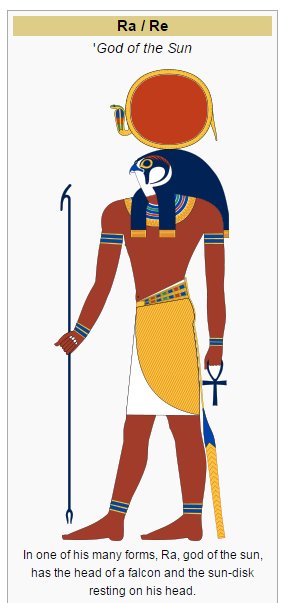 These are designed to harvest “energy,” and so they do. It's a spirit thing, and it's legit.
 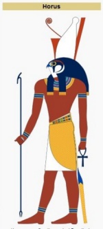 The connection is more familiar in this form, Rx.
  This ancient symbol is still widely recognized in connection with prescription drugs. It has been known as the mark of Jupiter but is best known as a ideograph of the Eye of Horus. The Rx is usually seen with the x being formed by crossing the extended leg of the R. This pictures the markings around the eye of the Peregrine falcon, the form of the sun god of ancient Egypt, Horus. An alternate identity is Ra, which is also spelled, Re. His name is embedded in the branding as REdbox. The connected r and x reveals that the arc represents the sun god's eye, the eye of Horus that is also known as the Eye of Re.

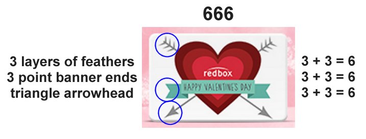

 (This is blatantly dramatized during, Back to the Future, and it may be that I'll present that in some future video.) The two arrows may be interpreted as the respective male members of Horus and Set. The redbox promotion features several layers of sodomite imagery because the heart shape not only pictures the vagina but also the butt. Sodomy is pictured as phallic arrows and the “db” male package symbolically and ritually penetrate the butt. In total there are 3 hearts and three phalluses. This superimposition of the three suggests what's called a male train, threesies or 3Cs. It might also considered that each arrow shaft is entering the 3 point arrowhead as an anal triangle.